Online Store Website Design: 7 Principles That Drive Sales in Indonesia
A good online store website design in Indonesia prioritises mobile loading speed under three seconds, clear visual hierarchy that guides buyers to the add-to-cart action, consistent brand identity across every page, and a checkout flow that surfaces local payment methods prominently. Aesthetics matter for trust. Structure determines whether that trust converts to revenue.
Key Takeaways
- Over 70% of Indonesian ecommerce sessions happen on mobile — mobile-first design is not optional, it is the primary design context
- Visual hierarchy — the deliberate arrangement of elements by importance — is more responsible for conversion rate differences between stores than any other single design decision
- A Shopify theme chosen for mobile performance and checkout flexibility outperforms a visually impressive theme with slow load times and rigid layout
- UI/UX design for ecommerce is not decoration — it is the architecture of how buyers navigate, evaluate, and decide; every element either reduces or adds friction
- Brand identity consistency across homepage, product pages, checkout, and post-purchase email is what makes a store feel trustworthy to a first-time buyer
- Conversion rate optimisation (CRO) built into the design brief from day one produces measurably better outcomes than visual redesigns applied to an existing structure
- Checkout design — specifically how Indonesian payment methods are presented and in what order — is the highest-leverage single-page optimisation available to any store
What Separates a Good Online Store Design from One That Just Looks Good
Indonesian ecommerce buyers make a trust judgement about an online store within the first three seconds of arrival. That judgement is based on visual signals — load speed, image quality, layout clarity, and brand coherence — not product quality, which they have not yet had time to evaluate. A store that fails the three-second trust test loses the visitor before a single product is seen.
But passing the trust test is only the entry requirement. What separates stores that convert from those that merely look credible is a set of deliberate structural decisions about how buyers move through the experience — from landing to product discovery to the add-to-cart action to checkout completion. These decisions constitute UI/UX design for ecommerce, and they are the subject of this article.
For concrete reference points, our breakdown of ecommerce website examples in Indonesia covers eight live stores analysed for exactly these qualities. The principles below are abstracted from what those stores — and the best-performing Shopify stores globally — consistently get right.
7 Online Store Design Principles for Indonesian Sellers
1. Mobile-First Design: Design for the Phone, Adapt for Desktop
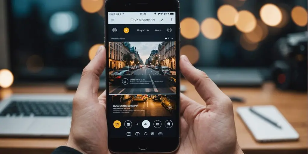
The most important design constraint for any Indonesian online store is that the majority of your buyers will arrive on a smartphone. Mobile-first design means designing the mobile experience first — navigation, product images, typography size, button dimensions, checkout flow — and adapting that experience to desktop, not the reverse.
The practical consequences are concrete. Navigation menus must be thumb-reachable. Product images must load fast and display correctly in portrait orientation. Add-to-cart buttons must be large enough to tap without zooming. Checkout forms must minimise typing through autofill support and pre-selected payment defaults. Every element that requires pinching, horizontal scrolling, or excessive tapping is a conversion leak on mobile that desktop-designed stores consistently miss.
Google’s mobile-first indexing documentation confirms that Google predominantly uses the mobile version of a site for indexing and ranking. A store that is not optimised for mobile does not just lose conversion on mobile — it ranks below mobile-optimised competitors for every relevant search query, regardless of device.
Test your store or any store you are evaluating with Google PageSpeed Insights on the mobile setting. A score below 70 on mobile represents measurable conversion loss. Stores with scores above 90 load in under two seconds on a mid-range Android device on a standard Indonesian 4G connection — the most representative test condition for your actual buyer.
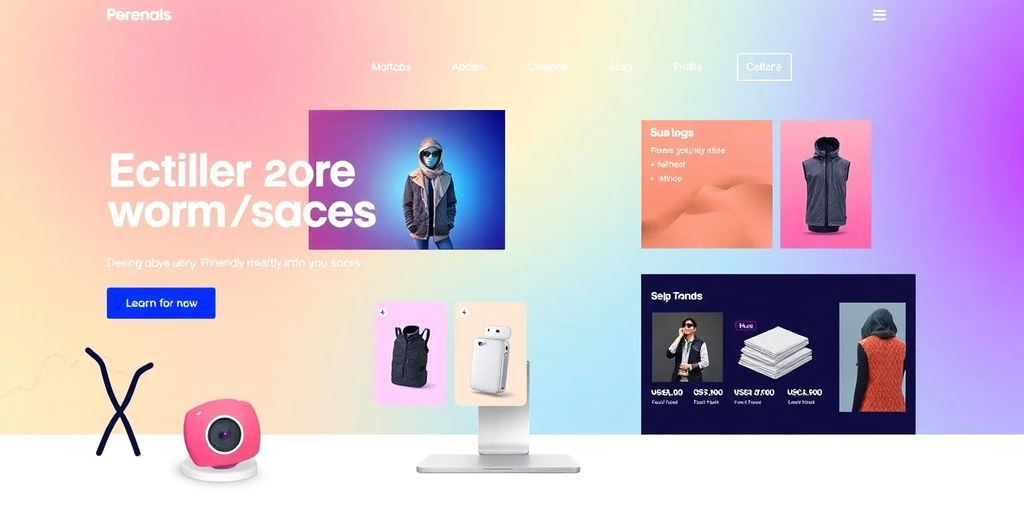
2. Visual Hierarchy: Guide the Eye, Guide the Decision
Visual hierarchy is the arrangement of design elements so that the most important information is seen first, in the correct sequence. On a product page, the hierarchy should be: product image → product name → price → key benefit → add-to-cart button → secondary information (reviews, description, specifications). Every element that appears before the add-to-cart button that does not directly support the purchase decision is adding friction.
According to Nielsen Norman Group’s ecommerce UX research, the most common visual hierarchy failure on product pages is placing social proof (reviews, endorsements) below the fold — at a position buyers reach only after they have already decided whether to add to cart. Moving the review summary (star rating and count) to immediately below the product title increases conversion on product pages measurably because it answers the buyer’s implicit question — “is this trustworthy?” — at exactly the moment the question forms.
On the homepage, visual hierarchy determines whether a first-time visitor understands within three seconds what the store sells, who it is for, and what the primary action should be. A homepage with five equally sized banners, three promotional carousels, and no clear primary CTA fails this test regardless of how visually polished each individual element is.

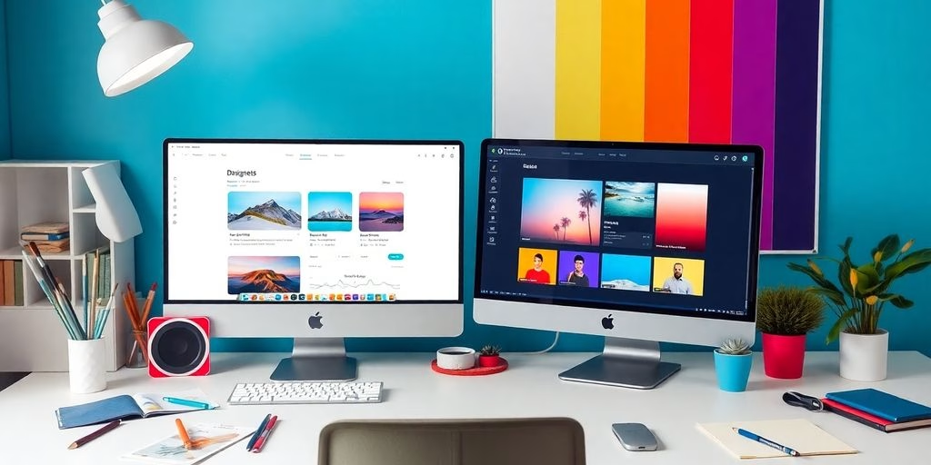
3. Shopify Theme Selection: Performance Over Aesthetics
For Indonesian brands building on Shopify, Shopify theme selection is one of the highest-leverage design decisions made before a single pixel of custom work begins. A well-chosen theme provides a performance baseline, a mobile-optimised layout structure, and a flexible section system that allows meaningful customisation without custom code. A poorly chosen theme imposes a performance ceiling that custom development cannot fully overcome.
The Shopify theme store offers both free and paid themes across a range of industry verticals. The evaluation criteria that matter for Indonesian stores are mobile PageSpeed score (published for each theme in the store), checkout flexibility, image loading behaviour (lazy loading for product galleries), and language support for Bahasa Indonesia. Themes that score above 80 on mobile PageSpeed before any customisation give you a performance foundation to build on. Themes that score below 60 should be rejected regardless of visual appeal — custom development will not recover those points.
For brands not yet on Shopify, understanding the platform’s capabilities is the prerequisite for any theme conversation. Our guide on what is Shopify and how it works covers the platform fundamentals before any design discussion begins.
4. UI/UX Design: The Architecture of Buyer Decisions
UI/UX design for ecommerce covers two distinct layers. UI (user interface) design concerns the visual presentation — colour, typography, iconography, spacing, and layout. UX (user experience) design concerns the structure of the buyer’s journey — how they navigate, where they land, what actions are available at each step, and how the flow guides them toward purchase. Both matter, but in a clearly defined hierarchy: correct UX structure with adequate visual polish outperforms beautiful UI built on a flawed UX architecture.
The Interaction Design Foundation’s UX design principles establish a framework directly applicable to ecommerce: reduce cognitive load (the number of decisions a buyer must make at any step), provide clear feedback (confirmation that actions have been registered), and maintain consistency (the same element behaves the same way on every page). Stores that violate these principles create confusion — and confused buyers abandon rather than asking for help.
For Indonesian stores specifically, four UX decisions have outsised impact. First, search functionality — Indonesian buyers on stores with large catalogues rely heavily on search, and a search bar that returns zero results for common synonyms loses buyers at the highest-intent moment. Second, product filtering — category pages without functional filters create decision paralysis in large catalogues. Third, cart persistence — buyers who add items and return to the store the next day expect their cart to be intact. Fourth, guest checkout availability — forcing account creation before purchase is one of the most documented conversion reducers in ecommerce UX research.
5. Brand Identity: Consistency Builds Trust at Scale
A first-time buyer arriving at an Indonesian online store has no prior relationship to draw on. Trust is built entirely through signals visible in the first session — and the most powerful of those signals is visual consistency. A store where the homepage typography matches the product pages, the colour palette is consistent from banner to checkout, and the photography style is unified across the catalogue signals a level of professionalism that inconsistent stores cannot replicate.
Brand identity in ecommerce design is not decoration — it is trust infrastructure. The specific elements that carry the most trust weight are logo placement and quality (present and correctly proportioned on every page), colour consistency (the same hex values used for CTAs, headers, and accents throughout), photography style (consistent lighting, background, and framing across all product images), and typography hierarchy (the same heading and body font used consistently rather than mixed across pages).
For brands that have not yet formalised their visual identity, investing in brand design before ecommerce build produces a measurably more cohesive store than retrofitting brand consistency onto a live site. Our branding and visual identity services cover this foundation work before store design begins.
6. Conversion Rate Optimisation: Design for the Decision, Not the Display
Conversion rate optimisation (CRO) in store design means structuring every page element to reduce the distance between arrival and purchase. It is not a separate discipline applied after launch — it is a design philosophy built into the brief from the first wireframe.
The most impactful CRO decisions in Indonesian store design are predictable across verticals. Social proof placement — review counts, star ratings, and user-generated content — must appear above the fold on product pages, not in a reviews tab at the bottom. Urgency mechanics — low stock indicators, limited-time offer countdowns — should be used sparingly and only when accurate, because Indonesian buyers are sensitive to perceived manipulation. Cross-sell and upsell placement in the cart — “you might also like” recommendations immediately before checkout — consistently increases average order value without adding friction to the purchase path.
According to Baymard Institute’s checkout research, 70% of shopping carts are abandoned globally. The top reasons — unexpected costs at checkout (shipping, fees), forced account creation, and payment method unavailability — are all design-solvable problems. A store that shows shipping costs early in the product page, offers guest checkout, and surfaces all Indonesian payment methods prominently at checkout eliminates the three most common abandonment causes in a single design pass.
7. Checkout Design: The Last Metre of the Conversion Path
Checkout design is the highest-leverage single-page optimisation available to any Indonesian online store — and the most commonly neglected. The checkout is where every trust and friction signal accumulated during the browsing session is either confirmed or undermined. A clean, fast, payment-rich checkout converts the buyer who was persuaded by the product page. A confusing, slow, or payment-limited checkout loses them at the final step.
For Indonesian stores, checkout design has three non-negotiable requirements. First, local payment method coverage: GoPay, OVO, DANA, ShopeePay, virtual bank transfers (BCA, Mandiri, BNI, BRI), and convenience store payments must all be available and surfaced prominently — not buried in a dropdown below credit card options that most Indonesian buyers do not use. Second, order summary visibility: the product, quantity, price, and shipping cost must be visible throughout the checkout without requiring the buyer to navigate back to confirm what they are paying for. Third, minimal form fields: every additional field in the checkout reduces completion rate. Name, address, and contact detail only — payment method handles the rest.
Accessibility is an additional consideration that most Indonesian stores have not yet addressed. The Web Content Accessibility Guidelines (WCAG) establish baseline standards for colour contrast, keyboard navigation, and screen reader compatibility. While enforcement is not yet a legal requirement in Indonesia, accessible design improves usability for all buyers — not just those with accessibility needs — and is increasingly a criterion in enterprise procurement evaluations.
Frequently Asked Questions
What is UI/UX design and why does it matter for online stores?
UI (user interface) design covers the visual elements of a store — colours, typography, layout, and imagery. UX (user experience) design covers the structure of the buyer journey — navigation, page flow, and the sequence of decisions from landing to checkout. Both matter for ecommerce, but UX structure determines whether buyers reach the checkout at all; UI design determines whether the store feels trustworthy when they get there. A store with strong UX and adequate UI consistently outperforms a visually impressive store built on a flawed user journey.
Which Shopify theme is best for an Indonesian online store?
The best Shopify theme for an Indonesian store is one with a mobile PageSpeed score above 80 before customisation, clean product page layouts that support multiple images and variant selection, and checkout flexibility for third-party payment gateway integration. Dawn (free), Impulse, and Prestige are consistently strong performers across these criteria. Theme selection should always start with the published mobile performance score in the Shopify theme store — visual appeal is secondary to load performance, which directly affects both conversion rate and Google search ranking.
How much does online store website design cost in Indonesia?
Cost varies significantly by scope and provider. A self-built Shopify store using a free theme costs nothing beyond the platform subscription (from USD 29/month) but requires significant time investment and produces limited customisation. A professionally designed Shopify store from a specialist agency — covering theme customisation, mobile UX optimisation, brand integration, and checkout configuration — typically ranges from IDR 15–50 million depending on catalogue size and design complexity. Custom-designed stores built from scratch cost substantially more and carry higher ongoing maintenance costs than theme-based Shopify builds.
How long does it take to redesign an existing online store?
A full redesign of an existing Shopify store — new theme, updated product photography, revised navigation structure, and checkout optimisation — typically takes 3–5 weeks with a specialist agency. This assumes clean product data and a defined brand identity. If the redesign includes a platform migration (moving from a custom-built site to Shopify), add 1–2 weeks for data migration and testing. Partial redesigns focused on a single area — checkout flow optimisation or mobile UX improvement — can often be completed in 1–2 weeks without touching the full store design.

Online store website design in Indonesia is not a one-time decision — it is an ongoing practice of testing, measuring, and improving. The seven principles above are the foundation: mobile-first structure, deliberate visual hierarchy, performance-oriented theme selection, sound UX architecture, consistent brand identity, CRO built into the design brief, and a checkout configured for Indonesian payment behaviour. Get these right from the start and you build a store that can compound improvement over time. Get them wrong and you spend subsequent months patching problems that a well-designed brief would have prevented.
CWORKS designs and builds Shopify stores for Indonesian brands with conversion and mobile performance as the primary design criteria — not aesthetics for their own sake. If you are starting a new store or planning a redesign, get a free design consultation and we will review your current store or brief against these principles and tell you exactly where the highest-impact improvements are.


![A Comprehensive Guide to Google Play Console Pricing [n8n]](https://cworks.id/wp-content/uploads/2025/09/cover-image-24622.avif)
![Understanding the Google Play Console Price: What Developers Need to Know [arvow]](https://cworks.id/wp-content/uploads/2025/05/4755037cthumbnail.avif)