Logo Design in Indonesia: Types, Examples, and What Makes a Good One
A logo is a visual mark that identifies a business — combining typography, shape, and colour to create instant recognition. A good logo works at any size, communicates the brand’s positioning at a glance, and remains distinctive in a competitive category. The five main logo types are wordmark, lettermark, brandmark, combination mark, and emblem — each suited to different business contexts and communication goals.

Key Takeaways
- A logo design is not a complete brand identity — it is one element of an identity system that also includes colour palette, typography, and usage guidelines
- A wordmark — a logo built entirely from typography — is the most common and often most appropriate logo type for Indonesian SMEs, because it communicates the business name directly without requiring the audience to learn a symbol
- Colour psychology in logo design is not arbitrary — the colours a brand chooses signal its category and positioning before the viewer has processed the logo’s shape or text
- Scalability is the most commonly overlooked technical requirement in Indonesian logo design — a logo must remain legible and recognisable at 16×16 pixels (app icon) and at 3×3 metres (signage) simultaneously
- F&B branding is the highest-volume logo design category in Indonesia — food and beverage businesses are the most active logo design buyers, and the category has the most defined design conventions
- A logo built on a strong brand identity system — with defined colour values, approved typefaces, and clear usage rules — is more commercially valuable than an isolated graphic, because it can be applied consistently across every touchpoint
What Is a Logo? Definition and Purpose
A logo is a distinctive visual mark that identifies a business, product, or organisation. It functions as the anchor of a brand identity — the element that appears most consistently across all brand touchpoints and that audiences use to recognise and recall the brand. A well-designed logo compresses the brand’s positioning — its category, its quality level, its character — into a single mark that communicates instantly.
The Indonesian term most closely equivalent to “logo” is the same word — logo — but the concept of a complete brand identity system is often compressed in Indonesian business contexts into just the logo itself. This creates a common commercial gap: Indonesian businesses frequently invest in a logo without investing in the supporting elements (colour system, typography, usage rules) that make the logo consistently effective across every application. A logo without a brand identity system is a mark without a language.
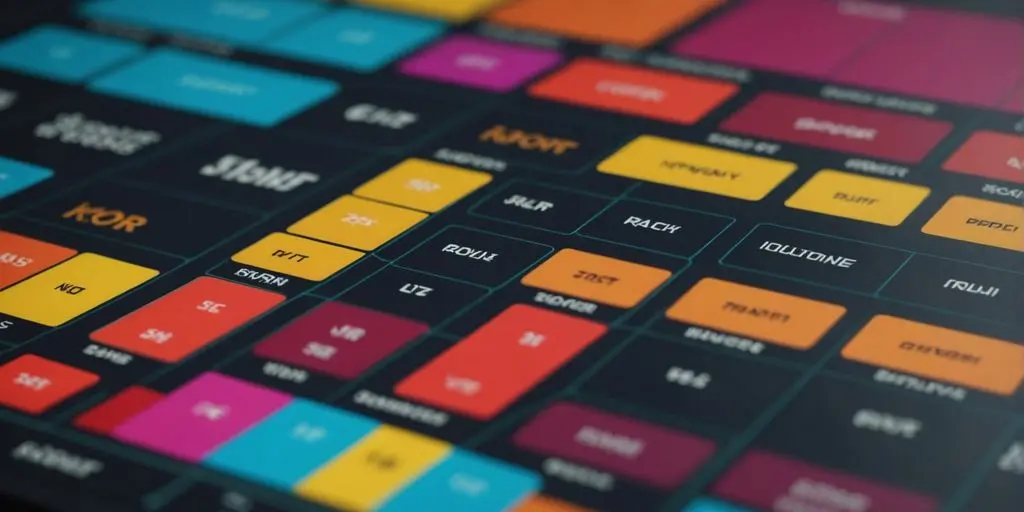
The 5 Logo Types — With Indonesian Examples
1. Wordmark
A wordmark is a logo built entirely from the business name set in a distinctive typeface. No icon, no symbol — just the name, rendered with enough typographic character to be immediately recognisable. Google, Coca-Cola, and FedEx are global examples. In Indonesia, many of the country’s most recognised brands use wordmarks: Bank Mandiri, Tokopedia (the text version), and numerous F&B chains whose name is their primary brand asset.
Wordmarks are particularly appropriate for Indonesian SMEs for two reasons. First, they communicate the business name directly — in a market where brand recall is still being built, there is no ambiguity about what business the mark represents. Second, they are simpler to execute well than symbol-based logos — the design variables are fewer, and a well-chosen typeface with considered letterform adjustments can create a highly distinctive mark without complex illustration work.
The critical design variable in a wordmark is typeface selection. Use Google Fonts to explore typefaces with strong character at display scale. Avoid generic system fonts (Arial, Times New Roman) — they carry no brand distinctiveness because they are used by millions of other documents. A custom typeface or a modified version of an existing one with unique letterform adjustments is the standard approach for professional wordmark design.

2. Lettermark (Monogram)
A lettermark uses the initials of a business name rather than the full name — IBM, HP, LG. This approach is most effective when the full business name is long, difficult to render elegantly at small sizes, or when the initials are already widely recognised. In Indonesia, lettermarks are common in corporate and professional services contexts — law firms, financial institutions, and holding companies frequently use initial-based marks that project professionalism without the informality of a pictorial symbol.
The design challenge with lettermarks is distinctiveness — two or three letters rendered in a typeface produce a relatively constrained design space, and many lettermarks end up looking similar to one another. Custom letterform design — drawing the initials as unique shapes rather than using an existing typeface — is the approach that produces lettermarks with genuine visual distinctiveness.
3. Brandmark (Symbol / Icon)
A brandmark is a purely visual mark — a symbol, icon, or abstract shape — with no text. Apple’s apple, Nike’s swoosh, Twitter’s bird. This is the most aspiration-aligned logo type but also the most demanding: a brandmark only works when the audience already associates the symbol with the brand, which requires years of consistent investment. For most Indonesian SMEs, launching with a brandmark-only logo is premature — the audience hasn’t yet been trained to associate the symbol with the business name.
Brandmarks become appropriate for Indonesian businesses once the brand has sufficient market presence that the symbol carries meaning independently — typically after three to five years of consistent brand investment across all touchpoints. Before that threshold, a combination mark (brandmark plus wordmark together) is the more practical choice.

4. Combination Mark
A combination mark pairs a symbol or icon with the business name — the most common and most commercially practical logo format for growing Indonesian businesses. The symbol adds visual distinctiveness and works as a standalone icon for app icons and social media profile images. The text component ensures the business name is immediately readable for audiences encountering the brand for the first time. Most professional logo commissions in Indonesia result in a combination mark for these reasons.
A well-designed combination mark also provides layout flexibility — the icon and text can be arranged horizontally, vertically, or used independently depending on the application. A horizontal lockup for a website header, a stacked version for a square social media profile, and the icon alone for a circular app icon — all from one design system. This flexibility is a functional requirement, not an aesthetic preference, for any brand that operates across multiple digital and physical touchpoints.
5. Emblem
An emblem integrates text inside or around a shape — a badge, crest, or seal format. Common in heritage brands, sports teams, educational institutions, and government organisations. In Indonesian commercial contexts, emblems appear frequently in traditional food brands, coffee shops with artisanal positioning, and businesses in the halal food sector where the certification badge aesthetic carries specific trust signals for the target audience.
The design limitation of emblems is scalability — the text-within-shape format becomes difficult to read at small sizes. Any business using an emblem logo must also have a simplified version (the shape without the internal text, or just the initials) for use at small scale on digital platforms. Browse our graphic design portfolio for examples of how CWORKS manages multi-format logo systems for Indonesian brands.
Logo Design for Indonesian Industries — Specific Guidance
F&B Logo Design (Logo Makanan, Logo Minuman)
F&B branding is the most commercially active logo design category in Indonesia and the one with the most defined design conventions. Food and beverage logos must communicate appetite appeal, freshness, and quality — while also differentiating the brand within an extremely crowded category. In Jabodetabek alone, thousands of new food businesses launch every month, and visual differentiation at the point of discovery (social media, GoFood, GrabFood listing) is a primary factor in trial conversion.
The colour conventions for Indonesian F&B logos are well-established: warm tones (red, orange, yellow) signal energy, appetite, and value-for-money positioning; earthy tones (brown, cream, terracotta) signal artisanal quality and natural ingredients; green signals health, freshness, and halal positioning; black and gold signal premium and luxury. These are conventions, not rules — a food brand can deliberately violate category colour conventions to differentiate, but the violation should be intentional and strategic rather than the result of aesthetic preference without competitive context.
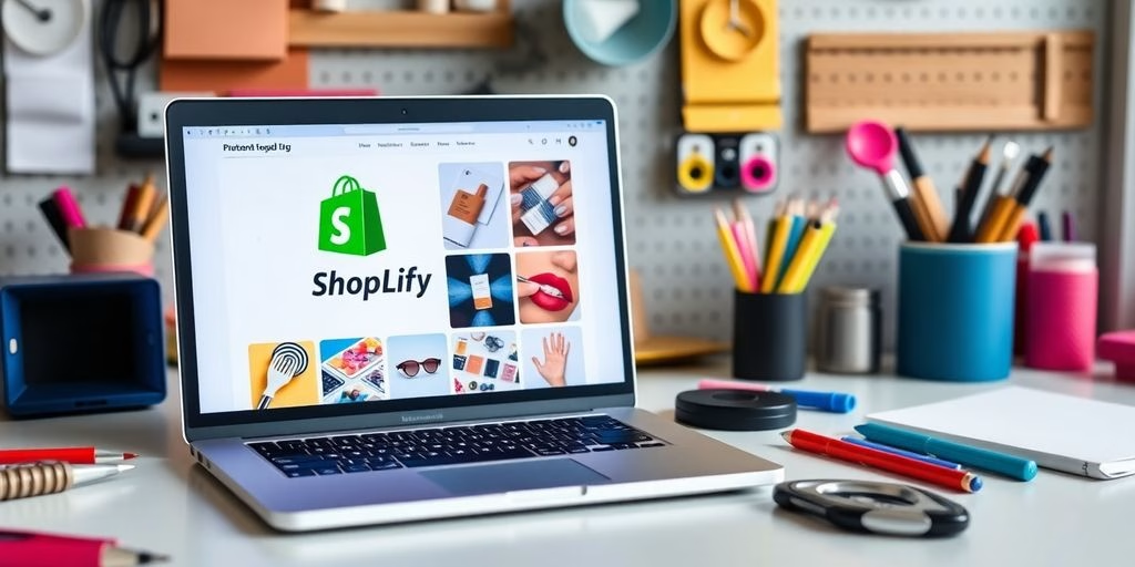
According to Shopify’s logo design guide, the most effective food brand logos use no more than two colours and avoid detailed illustrations that lose legibility at icon scale. For inspiration on how leading Indonesian F&B brands approach logo design, Behance’s Indonesian food logo design gallery shows current work from Indonesian designers across every food sub-category. For a framework connecting logo design to your wider brand visual system, our article on poster design for Indonesian businesses covers how logo usage on print collateral affects brand recognition.

Retail and E-Commerce Logo Design (Logo Toko)
Retail and online store logos in Indonesia face a specific design challenge: they must work effectively as a small icon on a marketplace listing (Tokopedia, Shopee), a social media profile picture, a WhatsApp Business profile, and a physical store sign — often simultaneously. This places scalability at the centre of the design brief from the outset.
The most common failure in Indonesian retail logo design is creating a detailed, complex mark that looks impressive at large size but becomes an unreadable blur at 32×32 pixels — the size at which it appears on a Tokopedia search result. The professional standard for any retail logo is to test it at 16×16 pixels before finalising the design. If it is not clearly legible at that size, the design needs simplification.
Corporate and Professional Services Logo Design (Logo Perusahaan)
Corporate logos for Indonesian businesses — PT, CV, yayasan — require a different balance from consumer-facing brands. The primary audience is B2B clients, procurement managers, and professional partners who are evaluating credibility and trustworthiness rather than appetite appeal or entertainment value. Corporate logos lean toward sans-serif wordmarks or combination marks with geometric symbols — clean, structured, and legible in formal document contexts including letterheads, legal agreements, and presentation decks.
What Makes a Logo Commercially Effective — The Evidence
Logo design effectiveness is measurable, not purely subjective. Research from the Nielsen Norman Group on brand recognition establishes that visual consistency across brand touchpoints — using the same logo, colours, and typography system across every customer interaction — is the primary driver of brand recall. A business that changes its logo or uses inconsistent versions across different platforms is actively eroding the recognition it has already built.
According to Adobe’s logo design research, colour increases brand recognition by up to 80%. This finding has direct implications for Indonesian businesses: the colour choices made during the logo design process are not aesthetic decisions — they are commercial decisions that will affect how quickly and accurately target customers recognise and recall the brand across years of market presence.
Colour psychology in logo design operates at a category level and a differentiation level simultaneously. At the category level, choosing colours that are broadly consistent with industry conventions signals that the brand belongs in the expected category. At the differentiation level, choosing a colour that stands out from the dominant colours used by competitors in the same category creates visual distinctiveness on a shelf, a marketplace listing, or a social media feed. The most effective logos do both: they feel right for the category while looking different from every competitor within it.
Scalability is the technical requirement that most Indonesian logo briefs fail to specify and most freelance logo designers fail to test. A logo file delivered as a 1000×1000 pixel JPG looks fine on screen — it looks fine until the client tries to use it at 16×16 pixels as an app icon, at which point a detailed mark becomes an unreadable smudge. Professional logo deliverables include vector format files (AI, EPS, or SVG) that can scale to any size without quality loss, plus optimised versions of the mark for use at small scale. Our branding and visual identity services include all format variants as standard deliverables.

Frequently Asked Questions
How much does logo design cost in Indonesia?
Logo design pricing in Indonesia spans a wide range by provider type. A freelance designer on a marketplace platform (Sribulancer, Fiverr) typically charges IDR 200,000–2,000,000 for a basic logo. A boutique design studio charges IDR 5–25 million for a professional logo with revisions and multiple file formats. A full-service creative agency — delivering logo plus colour system, typography guidelines, and application mock-ups — typically ranges from IDR 15–80 million. The price reflects not just the logo file but the strategic thinking, revision depth, and format completeness of the deliverable.
What file formats should I receive when I commission a logo?
A professional logo delivery should include: AI or EPS (vector source files editable in design software), SVG (scalable vector for web and digital use), PNG with transparent background (for use on any background colour), PNG on white background (for documents and presentations), and PDF (for print use). JPG is not an appropriate primary logo format — it has a white background and does not scale without quality loss. If a designer delivers only a JPG or PNG without vector files, the logo cannot be properly scaled for signage, embroidery, or large-format print.
Can I design my own logo using free tools?
Yes — Canva’s logo maker, Adobe Express, and Looka all offer logo generators accessible to non-designers. The limitation is distinctiveness: AI logo generators and template-based tools draw from shared libraries, which means the output frequently resembles logos already in use by other businesses. For a business where visual differentiation from competitors matters — particularly in crowded categories like F&B, fashion, and retail — a custom-designed logo from a professional designer produces a result that is genuinely unique. Template logos are acceptable for early-stage testing; custom logos are appropriate once the brand has committed to long-term market presence.
How many colours should a logo have?
Most professional logos use one to three colours. Single-colour logos (including black and white versions) are the most versatile — they work on any background and reproduce correctly in every printing context. Two-colour logos are the most common professional standard, offering visual complexity while remaining manageable across print and digital applications. Logos with more than three colours become expensive to reproduce in single-colour print contexts (embroidery, screen printing, single-colour stamps) and risk looking cluttered at small sizes. Every logo should also have an approved single-colour version for contexts where full-colour reproduction is not possible.
Logo design in Indonesia is both an aesthetic and a commercial discipline. The five logo types above cover the full range of Indonesian business contexts — from an F&B brand needing a warm combination mark that photographs well on GoFood to a PT needing a clean wordmark that projects credibility on a legal document. The principles that make a logo commercially effective — clarity, scalability, colour intentionality, and brand system integration — are consistent across every category and every budget level.
CWORKS designs logos and brand identity systems for Indonesian businesses across F&B, retail, e-commerce, professional services, and consumer goods — delivering vector files, colour systems, typography guidelines, and application mock-ups as standard. If you are ready to commission a logo or want to discuss how your current mark compares against the principles above, get in touch with the CWORKS team for a free initial consultation.


![A Comprehensive Guide to Google Play Console Pricing [n8n]](https://cworks.id/wp-content/uploads/2025/09/cover-image-24622.avif)
![Understanding the Google Play Console Price: What Developers Need to Know [arvow]](https://cworks.id/wp-content/uploads/2025/05/4755037cthumbnail.avif)