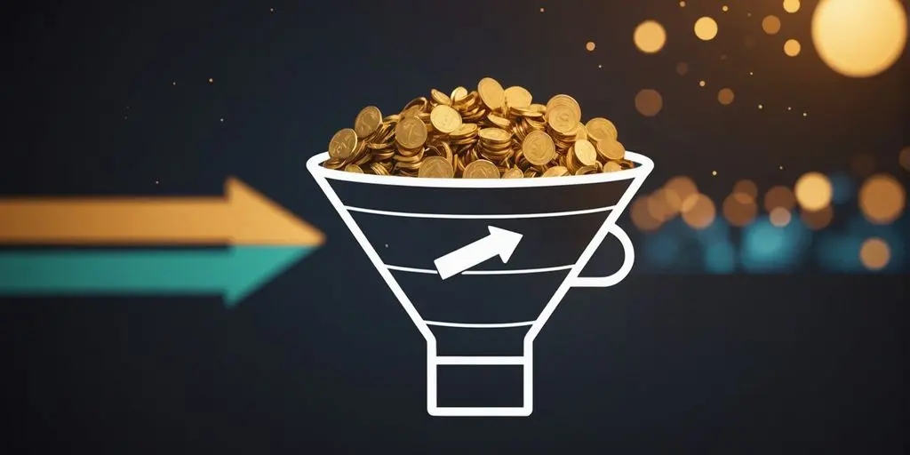
Landing page optimization is crucial for converting visitors into customers. By implementing key strategies and understanding the psychology behind user behavior, you can create a visually compelling and persuasive landing page. In this article, we will explore the essential strategies for landing page optimization that converts.
Key Takeaways
- Craft a compelling value proposition
- Design irresistible call-to-action buttons
- Understand user behavior and decision-making
- Utilize captivating imagery
- Prioritize mobile responsiveness
The Art of Landing Page Optimization

Crafting a Compelling Value Proposition
Let’s face it, your landing page is the digital equivalent of a first date. You want to look your best, say the right things, and leave them wanting more. Your value proposition is your pick-up line; it needs to be clear, concise, and charming enough to make visitors swipe right. Landing page optimization is your strategy. Here’s how to craft that perfect pitch:
- Identify your unique selling points: What makes you the Taylor Swift of your industry?
- Speak their language: Use words that resonate with your audience, not jargon that sends them running.
- Benefits over features: Remember, it’s not about what your product does, but how it makes life a fabulous disco party for the user.
Remember, the goal is to make your visitors think, “Where have you been all my life?” by showcasing the irresistible benefits of your offering.
In landing page optimization, don’t just tell them you’re “user-friendly” or “innovative”—show them with real results or testimonials. And always be testing! What works today might be tomorrow’s old news. Keep it fresh, keep it exciting, and most importantly, keep it relevant to your audience.
Designing Irresistible Call-to-Action Buttons
Let’s face it, in landing page optimization, your Call-to-Action (CTA) button is like that one friend who’s not afraid to tell you what to do – but in a good way! Your CTA is the not-so-secret sauce that can skyrocket conversions when done right. So, how do you make your CTA buttons not just clickable, but irresistible? Here’s the recipe:
- Keep it concise: Like a tweet from your favorite celebrity, make your CTA text short and sweet.
- Color it visible: Use a color that pops, but doesn’t give your visitors a pop quiz in finding it.
- Location, location, location: Place it where eyes naturally go. If your visitors need a map, you’re doing it wrong.
Remember, the goal is to make it entirely effortless for visitors to find the CTA. If they’re playing hide and seek with your button, you need to rethink your strategy.
And don’t forget to prioritize benefits over features. People don’t just want a ‘Free Trial’; they want to ‘Start Saving Time Now’. Give them the value they can’t ignore, and watch as they click their way to your desired action.
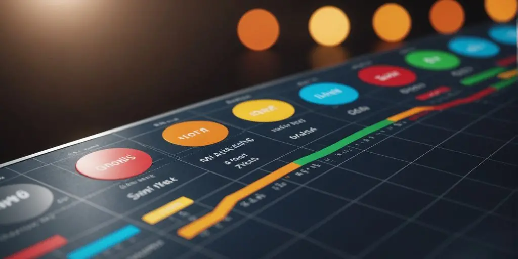
A/B Testing: Finding What Works
In the world of landing page optimization, A/B testing is like the scientific method for marketers. It’s where hypotheses meet reality and your creative genius gets a reality check. A/B testing is not just a tactic; it’s a strategy for continuous improvement.
Here’s the lowdown on how to A/B test like a pro:
- Identify your variables: Whether it’s the color of your ‘Buy Now’ button or the phrasing of your headline, pick one thing to test at a time.
- Set clear goals: What’s success? More clicks? Higher conversion rate? Define it before you test it.
- Gather data: Use tools (yes, there are other fish in the sea besides Google Optimize) to collect your stats.
- Analyze with care: Look for statistically significant differences, not just what you hoped to see.
Remember, A/B testing is about learning what resonates with your audience. Sometimes, it’s the small tweaks that make the biggest splash.
Don’t forget, while A/B testing can give you insights into user behavior, it’s not about chasing perfection. It’s about making informed decisions and being okay with the fact that sometimes, your landing page optimization is going to be a ‘work in progress’.
The Psychology of Landing Page Optimization and Conversion

Understanding User Behavior and Decision-Making
Peek into the minds of your visitors by putting on their digital shoes. It’s like being a mind reader, but without the crystal ball. Start by focusing on the user; their needs and pain points are your treasure map to golden conversions. Heatmaps are like x-ray vision for marketers, showing you where users click, linger, and bail.
- Focus on the User: Address their needs and pain points for better results.
- Utilize Heatmaps: Gain insights into user behavior on your landing page.
- Test One Element at a Time: Ensure clear results in A/B testing.
Remember, the goal is to make your landing page so intuitive, even your grandma would know how to navigate it.
Track and analyze data like a pro detective. It’s not just about the ‘who’ but the ‘how’ and ‘why’ they interact with your page. Simplify navigation to avoid the Bermuda Triangle of website design, where visitors mysteriously disappear. And always keep an eye on the competition—they might just inspire your next big idea.
The Power of Persuasive Content
Let’s face it, words can be like a secret sauce, adding that zesty kick to your landing page that makes visitors say, “Yum, I want in!” Crafting persuasive content is not just about throwing in fancy words; it’s an art form that marries psychology with the sweet science of conversion. Here’s the recipe for content that converts:
- Use Action-oriented Language: Whip up excitement with verbs that are as energetic as a double shot of espresso. Avoid the snooze-fest of passive voice.
- Leverage Social Proof: Sprinkle in testimonials like they’re parmesan on pasta. They’re the proof in the pudding that your product is the bee’s knees.
Remember, the goal is to make your content as irresistible as a chocolate lava cake. It should flow smoother than a jazz solo and be as convincing as your grandma when she says you look thin.
- Clear and Compelling Headlines: Think of your headline as the bouncer of your content club. It’s got to be strong enough to pull people in but friendly enough not to scare them away.
And don’t forget, the power words you use should fit like Cinderella’s slipper—perfectly. No one likes a forced fit, and that includes your landing page copy. Keep it relevant, keep it fluent, and watch your conversion rates dance to the rhythm of success.
Trust Indicators: Building Credibility
In the world of landing page optimization, trust isn’t just a five-letter word; it’s the secret sauce that turns skeptics into subscribers. Displaying trust signals like security badges or customer testimonials is like having a digital handshake that reassures visitors they’re in good company. But don’t just slap on some badges and call it a day! Here’s a quick trust-building to-do list:
- Flaunt those shiny testimonials—they’re like word-of-mouth on steroids.
- Security badges: not just for show, they’re the internet’s seal of approval.
- Case studies: because stories of success are always better than a sales pitch.
Remember, your landing page is like a first date. You wouldn’t show up in sweatpants and expect a second date, right? Dress to impress with credibility at every click.
And let’s not forget the importance of keeping your promises. If your landing page were a person, it should be the one your visitors would trust to water their plants while they’re on vacation. Continuously iterate and improve; it’s the only way to ensure your landing page remains the most trustworthy friend in the digital neighborhood.
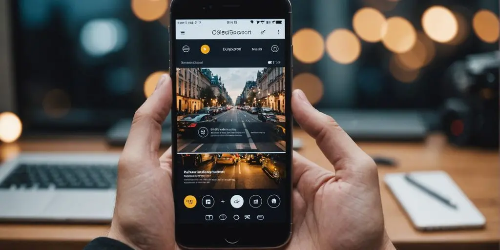
Landing Page Optimization: The Visual Storytelling

Captivating Imagery: The Silent Salesperson
They say a picture is worth a thousand words, but on your landing page optimization process, it might just be worth a thousand clicks. Captivating imagery can silently convince your visitors to stick around long enough to hear your pitch. Here’s how to make your visuals speak volumes:
- Use high-quality images that resonate with your audience’s desires and pain points.
- Align imagery with your brand to maintain consistency and recognition.
- Optimize loading times because nothing says ‘goodbye’ like a buffering icon.
Remember, your images are like the silent salespeople of your landing page; they can make or break the deal before a single word is read. So, dress them up for success!
Your visuals should not only be eye-candy but also strategically placed to guide the user’s journey towards the call-to-action. Think of them as visual breadcrumbs leading to the ultimate prize: conversion.
Color Scheme: The Subtle Influencer
Ever wondered why fast-food joints are all about reds and yellows? It’s not because they have a thing for ketchup and mustard. Landing page optimization likes colors. Colors have a sneaky way of tickling our subconscious, nudging us towards a decision without us even realizing it. Choosing the right color scheme for your landing page can be a game-changer.
- Red: Grabs attention, creates urgency.
- Blue: Instills trust, calms the nerves.
- Green: Go, go, go! It’s the color of ‘yes’ and money.
- Yellow: The happy-go-lucky hue that can lift spirits (and conversion rates).
Remember, it’s not just about picking pretty colors. It’s about picking the right colors that align with your brand and the psychological triggers of your audience.
And don’t just slap on a color palette and call it a day. Test those shades! What works for a luxury brand might make a budget-friendly site look like a dollar store disco. It’s all about the context, baby!
Mobile Responsiveness: The Everywhere Experience
In the era of smartphones glued to our palms, mobile responsiveness isn’t just a fancy feature; it’s the bread and butter of a successful landing page. Imagine a user squinting at their screen, pinching and zooming like they’re trying to decipher an ancient map—not the first impression you want to make.
- Responsive Design: It’s like yoga for your website; it stretches and adapts to any screen size.
- Fast Load Times: Because nobody likes to wait, not even for a second.
- Easy Navigation: If users need a compass to get around your page, you’re doing it wrong.
Remember, a mobile-friendly landing page is like a good date—charming, responsive, and doesn’t make you wait around.
While some may argue that desktops still reign supreme in certain B2B circles, the mobile wave is too big to ignore. After all, who wants to miss out on a sea of potential customers because their landing page can’t keep up with the times?
Conclusion
In conclusion, doing a landing page optimization for conversion is a crucial aspect of digital marketing. By focusing on design, strategic call-to-action placement, mobile responsiveness, A/B testing, trust indicators, a clear value proposition, simplified form fields, attention-grabbing headlines, and social proof elements, you can create a highly converting landing page.
Remember, a witty and engaging approach, along with continuous improvement, is key to capturing and retaining your audience. So, go ahead and apply these essential strategies to design a landing page that effortlessly converts visitors into satisfied customers!
Contact us if you want landing page optimization experts to do it for you!
FAQs
How do I do a landing page optimization for conversion?
To plan a landing page optimization for conversion, focus on the layout, call to action, A/B testing, engaging headline, color scheme, compelling imagery, mobile responsiveness, clear value proposition, trust element placement, and conversion rate optimization techniques.
What makes a highly converting landing page?
A highly converting landing page is created by focusing on effective copywriting, captivating visual design, strategic call-to-action placement, mobile responsiveness, A/B testing, trust indicators, a clear value proposition, simplified form fields, attention-grabbing headlines, and social proof elements.
What are the key elements of landing page optimization?
The key elements of landing page optimization include clear and compelling headlines, persuasive content, user-friendly design, strong call-to-action (CTA), simplified form fields, trust indicators, mobile responsiveness, and A/B testing.
How can I boost optimization for better conversion on my landing page?
To boost optimization for better conversion on your landing page, ensure that your landing page offer is clear, keep your landing page design simple, incorporate storytelling techniques, and continuously improve your landing page by monitoring rival brands and incorporating visitor feedback.
What are the key elements for conversion in a successful landing page design?
The key elements for conversion in a successful landing page design include a clear call-to-action (CTA), compelling headline, engaging content and design, and social proof.


![A Comprehensive Guide to Google Play Console Pricing [n8n]](https://cworks.id/wp-content/uploads/2025/09/cover-image-24622.avif)
![Understanding the Google Play Console Price: What Developers Need to Know [arvow]](https://cworks.id/wp-content/uploads/2025/05/4755037cthumbnail.avif)