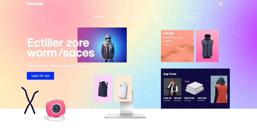
In the internet, a website structure is akin to the architecture of a building, providing the framework upon which user experience is built. Achieving consistency and user-friendly navigation is not just about aesthetic appeal; it’s a strategic endeavor that enhances user engagement, accessibility, and ultimately, the success of the website. This article delves into the key principles of website structure, emphasizing the importance of a cohesive and intuitive navigation system that serves as a compass for users, guiding them through the content with ease and precision.
Key Takeaways on Website Structure
- A clear and consistent navigation menu is the cornerstone of a user-friendly website, acting as a roadmap that guides visitors to their desired content with ease.
- Descriptive labels and a logical hierarchy in navigation design not only improve user experience but also bolster the site’s SEO by making content easily discoverable for both users and search engines.
- Maintaining a uniform layout, color scheme, and typography across the website fosters user familiarity and trust, enhancing the overall user experience.
- Accessibility and inclusivity in navigation design ensure that the website caters to a diverse audience, breaking down barriers and creating a welcoming environment for all users.
- A well-defined site structure that is intuitive and easy to navigate is essential for user engagement, making it straightforward for visitors to find the information they seek without confusion or frustration.
The Compass of Website Structure: Charting the Course with Clear Navigation

The Role of Main Menus in your Website Structure
Just as a GPS guides you through the twists and turns of city streets, the main menu of your website leads visitors through the digital landscape of your website structure. It’s the beacon that shines light on the path to discovery, ensuring that no user gets lost in the abyss of broken links and confusing layouts.
- Consistency and Clarity: Your navigation menu should be a steadfast companion, appearing consistently across all pages. Use clear, descriptive labels for top-level items to immediately convey the content found within each section.
- Visibility of Top-Level Items: Like a lighthouse guiding ships to shore, your most important pages should be readily accessible, ideally from any page on your site. Position these top-level items prominently to catch the user’s attention and facilitate quick access.
The key to a user-friendly navigation is not just about having a map, but making sure that map is easy to read, accessible from anywhere, and always points north.
For content-heavy websites, a mega menu might be the website structure of choice, displaying an extensive list of navigation options. On the flip side, sites with minimal content may opt for the simplicity of a horizontal bar, showcasing only the most relevant navigation options. Regardless of the style, the goal remains the same: to create an intuitive and seamless journey for every traveler that visits your site.
Page Organization: a Logical Journey
Embarking on a good website structure, users expect a logical hierarchy that guides them without confusion. Just as a city planner meticulously designs roads to ease traffic flow, a web designer must map out a site’s structure to facilitate effortless navigation. Here’s where the sitemap plays a pivotal role, acting as the master blueprint from which all pathways emerge.
- Main Pages and Sections: Clearly define the core areas of your site.
- Subcategories: Organize related content to simplify the user’s quest for information.
- Internal Linking: Connect pages to show relationships and guide visitors through your content.
A user’s journey through your website should be a stroll in the park, not a trek through a labyrinth.
Remember, the goal is to make every page accessible and to ensure that the content’s context and importance are crystal clear. By doing so, you not only enhance the user experience but also signal to search engines the priority of your pages, which is crucial for SEO success.
The Significance of Visibility for Top-Level Website Structure
When it comes to website structure and navigation, the visibility of top-level items is akin to having a well-lit, clearly marked path in a dense forest. Top-level items should shine like beacons, guiding users effortlessly to your site’s most valuable content. Here’s how to ensure they stand out:
- Consistency and Clarity: Like a trusty compass, your navigation menu should appear consistently across all pages. Descriptive labels for top-level items are the stars by which users navigate; they must be clear and immediately convey the content within.
- Strategic Layout: Organize your navigation to reflect the content’s hierarchy. High-priority sections deserve prime real estate, such as the header or sidebar.
- Responsive Design: In the mobile era, navigation must adapt to smaller screens without losing its way.
Remember, a user’s journey on your website should be a stroll in the park, not a trek through the wilderness.
By adhering to these principles, you create a website structure navigation experience that is not only user-friendly but also enhances the overall user experience. After all, a visitor who can find their way is a visitor who’s more likely to stay.
The Art of Seamless Surfing: an Intuitive User Experience

Consistency and Clarity: The Dynamic Duo of UX
In the realm of website structure, consistency and clarity reign supreme. These two principles are the bedrock of a user-friendly experience, ensuring that visitors can navigate your digital domain with ease. Consistency in design elements like color schemes, typography, and layout structure creates a sense of familiarity, allowing users to move through your site with intuitive grace.
Consistency is not just a buzzword; it’s the golden thread that ties together the various components of your website. When every part behaves in the same way, users don’t have to relearn how to interact with your site at every turn. This seamless experience is crucial for keeping your audience engaged and reducing the cognitive load that often leads to frustration and site abandonment.
By weaving clarity into the fabric of your site, you provide a clear path for users to follow, one that is free of ambiguity and confusion.
Here are a few key points to remember when aiming for consistency and clarity in your website design:
- Ensure that navigation menus are logical and straightforward.
- Maintain a uniform appearance across all pages.
- Use descriptive labels that speak directly to the user.
- Design with the user’s expectations in mind.
SEO-Friendly Navigation: The Roadmap to Good Website Structure
When it comes to the digital highway, SEO-friendly navigation is your trusty website structure to your destination—the content. A well-organized website structure not only delights users but also charms search engines, making it a dual-purpose powerhouse. Here’s how to gear up for the journey:
- Ensure main navigation consistency across all pages to avoid confusing your visitors or search engines.
- Link the business logo to the homepage, creating a reliable ‘home’ button.
- Keep menu options to a manageable number, ideally no more than seven, to prevent cognitive overload.
By adopting these guidelines, you lay a robust foundation for both SEO success and an intuitive user journey.
Remember, a clear hierarchy and simple navigation are not just about aesthetics; they are about creating a seamless path for users and search engines alike. As you design your navigation menu, think of it as an SEO hack, a strategic blueprint that guides visitors through your content while boosting your online visibility.
Descriptive Labels: Speaking the User’s Language
In the realm of web design, descriptive labels are the unsung heroes. They guide users with the precision of a seasoned tour guide, turning the complex maze of a website structure into a delightful stroll in the park. Consider the humble button – a portal to further content. A button labeled with ‘Submit’ is as informative as a map without landmarks. Instead, a button that says ‘Sign Up Now’ or ‘Join Our Email List’ is a beacon of clarity in the digital landscape.
By aligning labels with user expectations, we create a seamless experience that resonates with their intentions.
Here’s a quick checklist to ensure your labels are user-friendly:
- Use action-oriented language that prompts user engagement.
- Avoid technical jargon that might confuse non-tech-savvy users.
- Optimize labels for low bandwidth users, ensuring quick load times.
- Ensure consistency across all interactive elements for intuitive navigation.
Navigational Symmetry: The Key to a User’s Heart

Avoiding the Maze: Straightforward Paths to Content
Navigating a website structure shouldn’t feel like being dropped into a labyrinth without a map. Simplicity is the ultimate sophistication when it comes to guiding users through your digital domain. By avoiding the maze of complex navigation, you ensure that visitors can find what they’re looking for with ease, which is essential for keeping them engaged and reducing bounce rates.
Here’s how to keep your navigation straightforward:
- Discover new pages with a clear and logical structure, making all web pages easily accessible.
- Understand content relationships through internal linking, clarifying the context and importance of each page.
- Determine page hierarchy to signal which pages are a priority.
Remember, a user-friendly navigation is not just about getting from point A to B; it’s about creating a journey that feels intuitive and rewarding at every turn.
Optimizing site navigation and website structure is not just a design choice; it’s a strategic move towards better user experience and higher conversion rates. Focus on mobile optimization, internal links, technical issues, design, and user intent to ensure that your navigation system is not only sleek but also SEO-friendly and effective.
Jargon-Free Zones: Keeping it Simple and Accessible
In the realm of web design, simplicity reigns supreme. A jargon-free zone is not just about using plain language; it’s about creating an environment where intuitiveness and clarity are the cornerstones. By stripping away the complex technical lingo, we pave the way for a more inclusive and user-friendly experience.
Simplicity is not about a lack of complexity, but about the absence of unnecessary elements that can cloud the user’s path.
Here are a few key principles to keep in mind:
- Implementing principles of simplicity, consistency, feedback, and hierarchy enhances user experience.
- Graphic design optimizes user interaction and accessibility for seamless and inclusive digital experiences.
- Optimize navigation, integrate interactive elements, build trust.
- Responsive design is crucial for user experience.
- Prioritize website performance for conversions.
Remember, the goal is to guide users through your website with ease, not to challenge them with a puzzle. Keep it straightforward, and watch as your site becomes a haven for visitors seeking clarity and ease.
Hierarchical Harmony: A Logical Layout Love Story
In the realm of web design, hierarchical harmony is akin to a well-orchestrated symphony, where each element plays its part in creating a seamless user experience. The importance of visual hierarchy, minimalism, and consistency in UI design cannot be overstated. By simplifying the design, providing clear feedback, and using consistent typography and colors, we cater to better usability and a delightful user experience.
The key to a logical layout is not just about the aesthetic appeal; it’s about creating a clear path for discovery and interaction.
To achieve this, consider the following points:
- Layout and hierarchy work together to organize content in a logical and visually pleasing way.
- Visual hierarchy guides users’ eyes to the essential information, ensuring the offer is understood and the desired action is taken.
- A grid system provides order and consistency, while negative space enhances focus and readability.
Remember, a website’s structure is not just a technical necessity; it’s the backbone of a story that unfolds with each click. By implementing a hierarchical arrangement of web pages and their relationships to one another, we help visitors and search engines navigate with ease.
Laying the Foundations of Website Structure

User-Friendliness: The Cornerstone of Engagement
At the heart of every successful website structure lies the principle of user-friendliness. It’s the secret sauce that makes a site not just usable, but a joy to navigate. User-friendliness is more than a feature; it’s a commitment to your audience’s needs and preferences. It’s about creating an environment where users feel understood and valued, where every click brings them closer to their goals without confusion or frustration.
To achieve this, consider the following points:
- Simplicity is the soul of efficiency. A clean, uncluttered interface invites users to engage with content without feeling overwhelmed.
- Empathy is your design compass. By putting yourself in the shoes of your users, you can anticipate their needs and craft experiences that resonate on a personal level.
- Flexibility allows for a personalized touch, giving users the control to tailor their experience to their own liking.
By weaving these elements together, you create a tapestry of user engagement that not only meets but exceeds expectations.
Remember, a user-friendly site is not a static entity; it evolves with its users. It’s a dynamic space that adapts, grows, and improves over time, ensuring that the user experience remains top-notch, no matter the changing digital landscape.
Organized Structure: The Blueprint for Easy Discovery
Think of your website structure as the skeleton that holds the body of content together. Without it, you’d have a floppy mess on your hands, and nobody wants to sift through that. An organized structure is the backbone of user navigation, ensuring that visitors can find what they’re looking for with the grace of a ballet dancer. It’s not just about having a place for everything, but also about making sure everything is in its place.
- Discover new pages
- Understand content relationships
- Determine page hierarchy
These are the pillars of a good website structure. They allow users to glide from page to page, intuitively understanding how the content is related and where to find the next piece of the puzzle. And let’s not forget the search engines, those digital detectives love a good, organized crime scene. A logical layout makes it easier for them to index your content and serve it up to the right audience.
By implementing a clear navigation structure that separates content into logical categories, users and search engines alike can easily locate specific items, turning your website into a treasure map of information.
Aesthetic Consistency: Weaving a Visual Tapestry
In the realm of website structure, aesthetic consistency is the thread that binds the user experience into a cohesive whole. It’s about ensuring that every element on your site, from the header to the footer, sings in harmony with your brand’s visual symphony. This consistency is more than just a pleasing arrangement; it’s a silent guide that helps users navigate your digital space with ease and familiarity.
- Balance: Achieving a visual equilibrium that feels just right.
- Alignment: Ensuring elements line up in a way that’s both pleasing and practical.
- Color Harmony: Selecting a palette that reflects your brand and pleases the eye.
By weaving these elements together, you create not just a website, but a destination that invites exploration and engagement.
Remember, consistency in website structure is not merely about aesthetics; it’s about creating a seamless, intuitive, and engaging user experience. It enhances usability, fosters brand loyalty, and, when done right, can even boost your on-page SEO by making your content more digestible and your site more navigable.
Inclusivity in Interaction: Designing for Accessibility

Universal Design: Building Bridges, Not Barriers
In website structure, universal design is akin to building bridges that connect diverse islands of users. It’s about creating an online world where everyone, regardless of their abilities, can traverse with ease. Web accessibility is the practice of designing websites and digital experiences in a way that people with disabilities can easily navigate and consume content.
To achieve this, consider the following points:
- Ensure content is perceivable, operable, understandable, and robust for all users.
- Utilize clear fonts, high contrast colors, and ample white space.
- Incorporate assistive technologies and adhere to the Web Content Accessibility Guidelines (WCAG).
By weaving accessibility into the fabric of your website’s design, you not only uphold ethical standards but also enhance user experience for a wider audience, including those with disabilities.
Remember, an inclusive website is not just a nice-to-have; it’s a must-have in today’s digital landscape. It broadens your reach and, by extension, your impact. Embrace the principles of universal design and watch as your website becomes a beacon of inclusivity.
Inclusive Menus ij Websitr Structure
When it comes to the digital dining table, inclusive menus are the chef’s special that can’t be overlooked. Crafting menus that cater to a diverse audience is akin to preparing a feast that satisfies every palate. It’s not just about the flavors but also about the ease with which diners can access their preferred dishes.
- Clear labels and simple language ensure that everyone, from tech gurus to those less digitally inclined, can navigate with ease.
- Keyboard navigation and voice commands offer alternative ways to explore the menu, much like braille on physical signs.
- Consistent layout across pages provides a familiar environment, reducing the cognitive load and making the experience more enjoyable.
By optimizing user interaction and graphic design for accessibility, we’re not just being considerate; we’re enhancing the overall dining experience, leading to longer engagement and potential conversions.
Remember, an accessible website structure is like a well-lit, clearly signposted path through a forest. It invites more travelers to embark on the journey, ensuring no one is left behind. By adhering to these principles, we create a digital space that is welcoming and navigable for all.
Color and Contrast: Navigating the Spectrum of User Needs
When it comes to the visual elements of a website, color and contrast are not just about aesthetics; they’re about communication. High contrast between text and background is crucial for users with visual impairments, ensuring that everyone can navigate your digital terrain with ease. But beware, while contrast can be your ally, it can also be your foe. Too much of it, and you risk creating a visual cacophony that sends users scrambling for the exit.
Ensuring that your design caters to a spectrum of user needs isn’t just good practice; it’s a beacon of inclusivity in the digital world.
Remember, the colors you choose are more than just pretty shades; they convey emotions and meanings. The fiery reds and calm blues aren’t just colors but messengers of your brand’s story. Here’s a simple checklist to keep your color choices both appealing and accessible:
- Use high contrast for text and background to aid legibility.
- Consider colorblind users by avoiding problematic color combinations.
- Test your design with accessibility tools to ensure compliance.
- Keep it simple, yet significant, to maintain a balance that speaks to all.
Embracing diversity is at the heart of innovation. Our latest article, ‘Inclusivity in Interaction: Designing for Accessibility’, delves into the importance of creating experiences that everyone can enjoy, regardless of their abilities. We believe that accessible design is not just a nice-to-have, but a must-have in today’s world. To learn more about our commitment to inclusivity and how we can help you make your projects accessible to all, Contact us now and let’s achieve remarkable success together!
Conclusions
As we’ve journeyed through the labyrinth of website structure, we’ve seen that the Minotaur at the center isn’t a fearsome beast, but the heart of user experience—clear, consistent navigation. Like breadcrumbs left by Hansel and Gretel, our navigation cues guide users safely through the digital woods. Remember, a website should be as welcoming as a grandma’s house, not a bewildering maze.
Keep your navigation website structure simple, your structure logical, and your content as digestible as a home-cooked meal. By embracing these principles, you’ll not only win the hearts of your visitors but also give search engines a clear path to follow. So, let’s raise a toast to intuitive design—may your users never feel lost, and may your site’s SEO flourish like a well-tended garden.
FAQs
What role does consistency play in website structure navigation?
Consistency reinforces familiarity and helps users feel confident and comfortable as they interact with your site. Leveraging standard navigation patterns like breadcrumbs, top and side menus, and footer links creates a user-friendly site that caters to a wide range of user needs and preferences.
How can I make my website’s navigation clear and straightforward?
Ensure your navigation is clear and consistent by using a main navigation menu that serves as a roadmap for your website. Organize your pages logically for a natural, intuitive flow, and make your most important pages readily accessible.
Why is it important to have descriptive labels for top-level navigation items?
Descriptive labels for top-level navigation items immediately convey the content within each section, ensuring clarity and helping users find what they’re looking for quickly. This clarity also aids in maintaining a consistent and intuitive user experience.
How does a well-structured website benefit SEO?
A well-structured website with clear page titles and headers guides users through your content and maintains consistency, which not only improves user experience but also enhances search engine optimization by making it easier for search engines to crawl and index your site.
What are the key elements of a user-friendly site structure?
A user-friendly site structure should have features that are accessible and easy to use, an organized layout for easy discovery of information, readable web typography and color schemes, and aesthetic consistency across all pages to maintain visual harmony and brand identity.
How does navigation design impact a user’s experience on a website?
Navigation design plays a pivotal role in providing a positive user experience by allowing users to find what they’re looking for with minimal effort. It involves using descriptive, easy-to-understand labels for menus and links, and ensuring navigation is consistent across all pages to avoid confusion.


![A Comprehensive Guide to Google Play Console Pricing [n8n]](https://cworks.id/wp-content/uploads/2025/09/cover-image-24622.avif)
![Understanding the Google Play Console Price: What Developers Need to Know [arvow]](https://cworks.id/wp-content/uploads/2025/05/4755037cthumbnail.avif)


 EN
EN  ID
ID