What Is an Infographic? Types, Examples, and How to Make One in Indonesia
An infographic is a visual communication format that combines data, text, and design elements to present complex information clearly and quickly. In Indonesia, businesses use infographics across social media, presentations, reports, and marketing materials. The main types are statistical, process, timeline, comparison, and geographic infographics — each suited to different content and communication goals.

Key Takeaways
- An infographic combines data, visuals, and text into a single image — readers process infographic content 60,000 times faster than plain text, according to research cited by HubSpot
- Data visualisation is the core discipline behind infographic design — the choice of chart type, colour, and layout directly determines how accurately the audience interprets the information
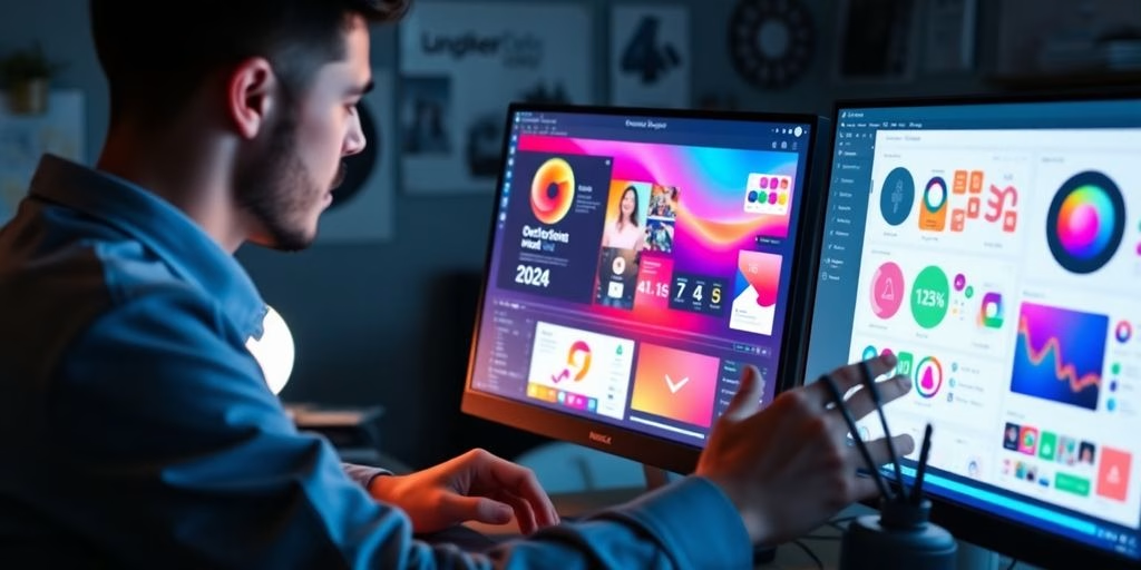
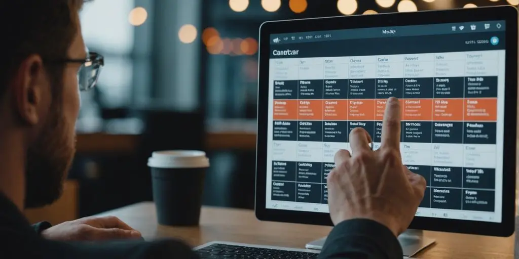
- Canva and Piktochart are the most widely used infographic tools in Indonesia for non-designers; Adobe Illustrator and Figma for design professionals
- Visual hierarchy — size, colour weight, and spatial arrangement — determines what the reader sees first and what action they take after reading
- Infographics that align with a company’s brand identity (consistent colours, fonts, and logo placement) outperform generic templates in building brand recognition over time
- As a content marketing asset, infographics generate 3x more social shares than other content types — making them one of the highest-ROI formats for Indonesian brands on Instagram and LinkedIn
What Is an Infographic? A Clear Definition
The word infographic is a contraction of “information graphic” — a format that translates data or complex concepts into a visual format a reader can understand at a glance. Where a standard report requires the reader to process paragraphs of text and separate charts sequentially, an infographic integrates both into a single designed object where relationships, hierarchies, and key numbers are immediately legible.
In Indonesia, infographics appear most commonly in three contexts: social media posts (particularly Instagram carousel slides and LinkedIn single-image posts), internal business documents (reports, presentations, and training materials), and marketing collateral (product comparisons, process explanations, and campaign one-pagers). The format’s combination of visual appeal and information density makes it one of the most shared content types on Indonesian social platforms.
The effectiveness of an infographic depends almost entirely on the quality of its data visualisation decisions — not on how visually decorative it is. An infographic with correct chart types, honest data representation, and a clear hierarchy communicates more effectively than a visually ornate one where the design obscures rather than reveals the underlying information.
The 5 Main Types of Infographics — With Indonesian Examples
1. Statistical Infographic
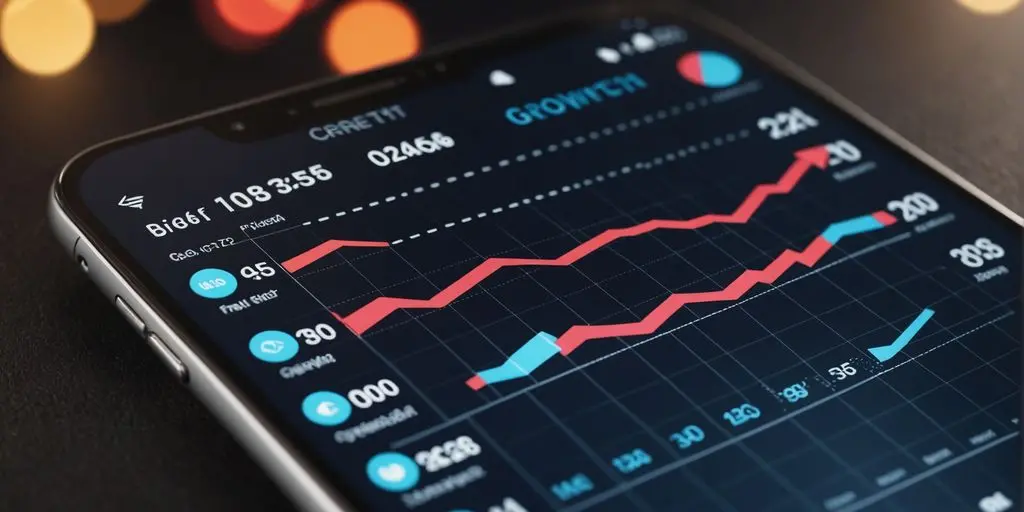
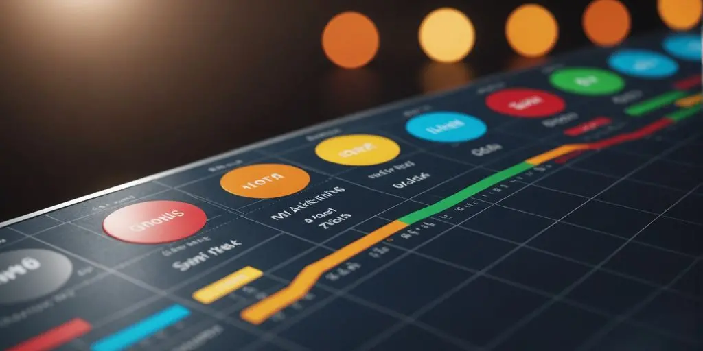
A statistical infographic presents numerical data — survey results, market statistics, performance metrics — using charts, graphs, and large-format numbers. This is the most common infographic type used by Indonesian businesses in annual reports, marketing decks, and social media performance posts.
The design principle for statistical infographics is that the chart type must match the data relationship being communicated. Bar charts for comparison between categories. Line charts for trends over time. Pie charts only for proportional data with fewer than five segments — pie charts with eight or more segments are universally difficult to read regardless of design quality.

2. Process Infographic
A process infographic shows sequential steps — how a system works, how a product is made, how a service is delivered. It uses numbered steps, arrows, and flow indicators to guide the reader through a defined sequence. Indonesian businesses use process infographics extensively for onboarding materials, product explainers, and operational procedure documentation.
The design principle for process infographics is directional clarity — the reader must never be uncertain about which step comes next or which direction the flow moves. Left-to-right and top-to-bottom are the two natural reading directions for Indonesian audiences; circular or complex branching flows increase cognitive load without proportional benefit in most communication contexts.

3. Comparison Infographic
A comparison infographic places two or more options side by side across consistent criteria — product A versus product B, before versus after, option one versus option two. The parallel structure makes differences immediately visible without requiring the reader to hold information from one section while reading another.
This is one of the most effective infographic types for Indonesian ecommerce brands comparing product specifications, service tiers, or pricing options. The visual symmetry of a well-designed comparison infographic signals fairness and transparency to the reader — a trust signal that text-based comparisons cannot replicate as efficiently.
4. Timeline Infographic
A timeline infographic maps events, milestones, or developments along a chronological axis. Businesses use timeline infographics for company history presentations, project roadmaps, product development histories, and market evolution storytelling. The horizontal or vertical axis provides an inherent structure that makes the relationship between events and time periods visually self-evident.
5. Geographic Infographic
A geographic infographic uses a map as its base structure, overlaying data points, distribution patterns, or regional comparisons onto geographic shapes. For Indonesian businesses operating across the archipelago — 17,000 islands across multiple time zones — geographic infographics are particularly useful for visualising regional performance, distribution coverage, and market penetration data.
How to Make an Infographic: A Step-by-Step Guide
Step 1: Define Your Single Message
Every effective infographic communicates one primary idea. Before opening any design tool, write one sentence that states exactly what the reader should understand or do after viewing the infographic. This sentence governs every subsequent decision — what data to include, which chart type to use, how much text to add, and what the visual emphasis should be. Infographics that try to communicate five ideas communicate none of them clearly.
Step 2: Gather and Verify Your Data
Data accuracy is non-negotiable in infographic design. An infographic with incorrect statistics damages brand credibility in a way that no visual polish can repair. Cite your data sources — either within the infographic itself in small type at the bottom, or in the caption when publishing on social media. Indonesian audiences increasingly scrutinise data claims, particularly in business and health contexts.
Step 3: Choose Your Infographic Type
Match the type to the data relationship. Numbers over time → line chart. Category comparison → bar chart. Part-to-whole relationship → pie chart (under five segments only). Sequential steps → process infographic. Before-and-after or option comparison → comparison infographic. Using the wrong chart type for a data relationship is the most common technical error in Indonesian infographic design.
Step 4: Design Using a Tool — Free Options for Indonesia
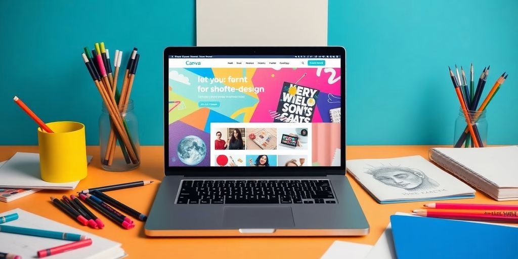
Canva is the most accessible starting point for Indonesian non-designers. Its infographic template library covers all five types above, and the free tier provides sufficient functionality for most business use cases. The Canva infographic maker includes pre-built Indonesian-language templates and supports direct export to social media dimensions.
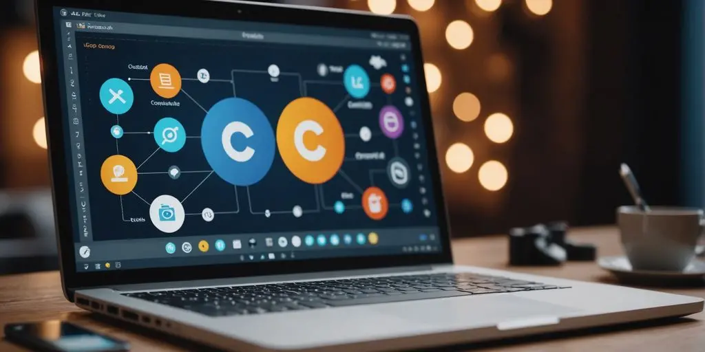
Piktochart offers more advanced data import functionality — connecting directly to Google Sheets or CSV files to auto-populate charts — which makes it more efficient for infographics that require frequent data updates. For brands that produce regular performance reports or weekly data summaries, Piktochart’s live data connection reduces the time cost of keeping infographics current.
For design professionals, Adobe Illustrator remains the standard for infographics requiring precise print output or complex custom illustration. Use Adobe Color to build a harmonious colour palette before starting — colour choices are the most visible differentiator between professional and amateur infographic design.

Step 5: Apply Visual Hierarchy and Brand Colours
Visual hierarchy in infographic design is controlled through three variables: size (larger elements are read first), colour weight (high-contrast or saturated colours draw attention before muted ones), and spatial position (top-left in a horizontal layout is the entry point for most readers).
Apply your brand identity colours as the primary palette — not a generic template colour scheme. An infographic in your brand colours, with your logo in the correct position and your brand font for headlines, functions as a brand asset that reinforces recognition every time it is shared. An infographic in a template’s default palette is a one-time piece of content that builds no accumulated brand value. For brands without a defined colour system, our branding and visual identity services establish this foundation before any content production begins.

Step 6: Export at the Correct Dimensions for Your Platform
Export dimensions vary by platform and use case. For Instagram single-image posts: 1080×1080 px (square) or 1080×1350 px (portrait). For Instagram carousel slides: 1080×1080 px per slide. For LinkedIn: 1200×627 px (landscape) or 1080×1350 px (portrait). For presentation slides: 1920×1080 px (16:9). For print at A4: 2480×3508 px at 300 DPI. Always export as PNG for infographics with text — JPG compression artefacts make fine text illegible at social media display sizes.
Why Infographics Work — The Evidence
The business case for infographic investment is well-documented. According to HubSpot’s visual content marketing research, infographics are liked and shared on social media three times more than any other type of content. For Indonesian brands competing for attention on platforms where organic reach is declining, this share multiplier represents a meaningful return on design investment.
Research from the Nielsen Norman Group on how users read web content establishes that most users scan rather than read — consuming content in an F-shaped pattern that prioritises the first two or three lines and left-aligned content. Infographics circumvent this pattern entirely by making the visual the primary attention object rather than the text, which means well-designed infographics achieve higher comprehension rates than equivalent text-based content for the same information.
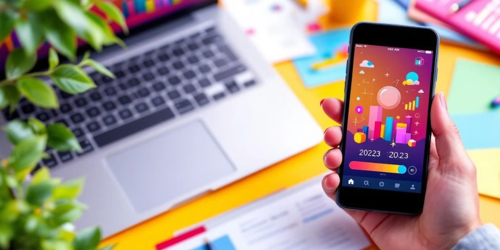
Indonesia had over 139 million social media users as of 2024, according to Statista’s Indonesia social media data. Instagram and LinkedIn are the two platforms where infographics generate the strongest engagement for Indonesian B2C and B2B brands respectively. The format’s combination of mobile-optimised vertical layout, scannable information density, and high shareability makes it structurally well-suited to how Indonesian audiences consume content on both platforms.
As a content marketing investment, the ROI calculation for infographics is straightforward: a single well-designed infographic can be repurposed across Instagram, LinkedIn, presentations, website blog posts, email newsletters, and printed collateral — typically six to eight content uses from one design asset. Browse our graphic design portfolio to see how CWORKS produces infographics for Indonesian brands across multiple formats from a single brief.

Frequently Asked Questions
What is the difference between an infographic and a poster?
A poster is a single-purpose visual display designed primarily for physical printing and viewing at a distance — typically promotional, event-based, or awareness-focused. An infographic is a data communication format designed to explain, compare, or visualise information — it works equally well digitally and in print, and its primary purpose is comprehension rather than promotion. Infographics almost always contain data, charts, or sequential information; posters may contain none of these. An event announcement is a poster. A breakdown of event attendance statistics is an infographic.
How long does it take to design an infographic professionally?
A professionally designed infographic from a brief to final file typically takes 3–5 business days for a standard single-page design. This covers brief clarification, data verification, initial concept, two rounds of revision, and final export in all required formats. Rush turnarounds of 24–48 hours are possible for simpler statistical or process infographics with pre-verified data. Timeline infographics and geographic infographics with custom illustration elements typically take longer — 5–7 days — due to the complexity of the map or timeline artwork.
Can I use Canva to make a professional-quality infographic?
Yes, with important caveats. Canva’s free templates produce acceptable results for internal documents, social media posts, and presentations where brand precision is not critical. For client-facing materials, investor presentations, or branded marketing collateral, Canva’s template-based output is visually distinguishable from custom-designed work — experienced audiences recognise common templates on sight. For a brand building long-term recognition, a custom-designed infographic system with defined brand colours, typography, and icon style is meaningfully more effective than repeatedly using public templates.
What makes an infographic bad or ineffective?
The four most common failures in Indonesian infographic design are: too many messages competing for attention (no clear hierarchy), incorrect chart types for the data relationship (a pie chart with twelve segments, for example), inaccurate or unverified data presented as fact, and poor mobile optimisation — text that is too small to read on a smartphone screen. The fifth is visual complexity added for aesthetic reasons that actively obscures the data it should be explaining. A simpler, more accurate infographic always outperforms a visually impressive one that confuses its audience.
Infographics are one of the most versatile and cost-effective content formats available to Indonesian businesses — when designed correctly. The five types above cover the full range of business communication needs, from statistical reporting to process documentation to competitive comparison. The six-step creation process above applies whether you are using Canva for a quick social post or commissioning a custom designed asset for a major campaign.
If your brand needs infographics that go beyond what templates can deliver — custom-designed, brand-accurate, and built for repurposing across formats — get in touch with the CWORKS team. We design infographics for Indonesian brands across social media, presentations, reports, and print collateral, with a brief-to-delivery process that handles everything from data verification to final file export.


![A Comprehensive Guide to Google Play Console Pricing [n8n]](https://cworks.id/wp-content/uploads/2025/09/cover-image-24622.avif)
![Understanding the Google Play Console Price: What Developers Need to Know [arvow]](https://cworks.id/wp-content/uploads/2025/05/4755037cthumbnail.avif)