Packaging Design in Indonesia: Types, Examples, and What Makes Them Work
Packaging design is the creation of the container, wrapper, label, and structural format that holds and presents a product. Good packaging does three things simultaneously: it protects the product, communicates the brand’s identity and product information, and differentiates the product from competitors at the point of purchase. In Indonesia’s competitive consumer market, packaging is often the first and only brand touchpoint before a purchase decision is made.

Key Takeaways
- Packaging design combines structural engineering and graphic design — the shape, material, and visual elements of a package must work together as a single system
- A product label is the primary information carrier on most Indonesian consumer packaging — it must communicate brand identity, product name, ingredients or contents, and regulatory requirements in a legible hierarchy
- A dieline is the flat template that defines the package structure before folding or forming — designing without a correct dieline produces artwork that does not align with the finished package
- Food and beverage packaging in Indonesia must comply with BPOM labelling regulations — ingredient lists, nutrition facts panels, halal certification marks, and production/expiry dates are mandatory elements with defined placement requirements
- Print finish choices — lamination type, spot UV, foiling, embossing — are the tactile and visual decisions that most directly communicate a product’s price positioning to the buyer before the package is opened
- Consistent brand identity across packaging, label, and outer carton builds shelf recognition that compounds with every retail encounter — off-brand packaging undermines recognition built across all other touchpoints
What Is Packaging Design? Function, Structure, and Communication
Packaging design operates across three levels simultaneously, and the most effective packaging addresses all three. At the functional level, the package must protect the product during transport, storage, and shelf life — structural integrity, material selection, and seal quality are engineering decisions that precede any graphic design work. At the communication level, the package must present the brand and product information clearly at the viewing distance and lighting conditions of its primary retail environment. At the competitive level, the package must stand out from adjacent products on a physical shelf or a marketplace thumbnail.
In Indonesia, the retail environments where packaging must perform are diverse: traditional markets (pasar), minimarkets (Alfamart, Indomaret), modern supermarkets (Hypermart, Transmart), and digital marketplaces (Tokopedia, Shopee, GoFood). Each environment imposes different viewing distances, lighting conditions, and competitive density — a package designed exclusively for supermarket shelf presentation may perform poorly as a 200×200 pixel product thumbnail on Tokopedia. Professional packaging design accounts for all primary distribution channels from the outset.
Indonesian Packaging Types — With Examples
1. Flexible Packaging (Kemasan Fleksibel)
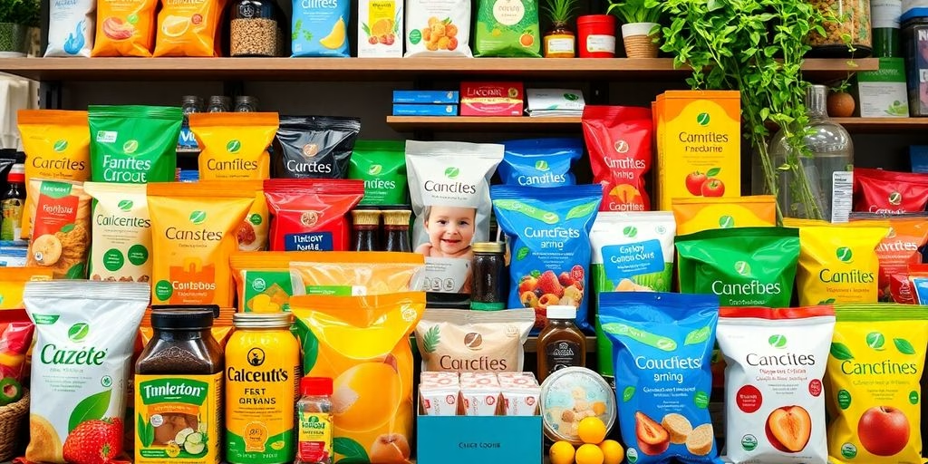
Flexible packaging — pouches, sachets, stand-up bags, and roll film — is the dominant packaging format for Indonesian FMCG products in food, beverage, personal care, and household categories. The format’s combination of low material cost, lightweight transport, long shelf life, and high graphic print quality makes it the default choice for most Indonesian consumer goods brands at every price point.
The most commercially active sub-category is the food and beverage packaging pouch — particularly for kopi (coffee), teh (tea), snack makanan ringan (light snacks), and minuman sachet (sachet beverages). Indonesia’s enormous coffee culture has created a thriving market for premium single-origin and blended coffee brands, and kemasan kopi (coffee packaging) design has become one of the most design-intensive and brand-differentiated packaging categories in the country. Browse our graphic design and packaging portfolio or Behance’s Indonesian packaging design gallery for a current view of how the country’s best designers approach this category.

2. Rigid Packaging (Kemasan Kaku)
Rigid packaging — boxes, cartons, tins, bottles, and jars — is used for products where structural integrity, premium positioning, or product visibility are primary requirements. In the Indonesian market, rigid packaging appears most prominently in premium food gifts (hampers Lebaran, premium snack boxes), personal care and cosmetics (bottles, tubes, compact boxes), household products, and industrial goods.
The design discipline for rigid packaging differs from flexible packaging in one critical respect: the dieline. A rigid carton box requires a precisely engineered flat template — specifying fold lines, glue tabs, window cuts, and tuck locks — before any graphic design work begins. Applying artwork to an incorrect or poorly engineered dieline produces a finished box where images are cut by fold lines, text is hidden by glue tabs, or structural elements fail under normal retail handling. For reference dieline templates and technical specifications, The Dieline and Adobe Illustrator’s packaging documentation is the leading international packaging design publication with an extensive library of structural formats.
3. Paper and Kraft Packaging
Paper and kraft packaging — bags, wrapping paper, kraft boxes, and paper tubes — has grown significantly in the Indonesian market as consumer awareness of plastic waste increases and brands respond to demand for more sustainable packaging options. Kraft packaging also carries specific brand associations: natural, artisanal, and premium-without-pretension positioning signals that resonate strongly with Indonesian millennial consumers in food, coffee, and specialty retail categories.
The design constraint of kraft and uncoated paper packaging is colour reproduction — uncoated surfaces absorb ink differently from coated or laminated substrates, which means colours appear more muted and less saturated than on glossy packaging. Designs for kraft packaging should use bold, high-contrast graphics and reduced colour palettes that remain impactful after the natural ink absorption of uncoated paper. Detailed gradients and photographic imagery that look impressive on screen frequently disappoint on kraft stock.

4. Product Label Design (Desain Label Produk)
A product label is the primary communication surface on most Indonesian consumer packaging — particularly for bottles, jars, tubes, and flexible pouches where the structural packaging itself carries no printed information. The label must accomplish in a limited surface area what a full packaging design accomplishes across multiple panels: brand identity, product name and variant, key benefit communication, and all mandatory regulatory information.
For Indonesian consumer products regulated by BPOM (Badan Pengawas Obat dan Makanan), label design is not purely a creative decision — it is a compliance exercise. Food and beverage labels must include the product name, ingredient list in descending order by weight, net content, name and address of the manufacturer or importer, BPOM registration number, production date and expiry date, and halal certification mark (if applicable). The BPOM labelling regulations specify minimum font sizes, mandatory placement positions, and language requirements for each element. Non-compliant labels can result in product withdrawal from retail — making BPOM compliance a design brief requirement, not an afterthought.

Print Finish Options for Indonesian Packaging
Print finish decisions are made after the graphic design is finalised but before production begins — and they have a disproportionate impact on how the finished packaging communicates quality and price positioning. The most common print finish options available from Indonesian packaging printers are:
| Finish Type | Effect | Best For | Cost Indicator |
|---|---|---|---|
| Glossy Lamination | High shine, vibrant colours | Snack food, mass-market FMCG | Low |
| Matte Lamination | Soft, tactile, non-reflective | Premium food, coffee, beauty | Low–Medium |
| Spot UV | Selective gloss on matte base | Logo highlight, premium positioning | Medium |
| Hot Foil Stamping | Metallic gold, silver, holographic | Gift packaging, premium tier | Medium–High |
| Embossing / Debossing | Raised or recessed texture | Luxury, heritage brands | High |
| Soft Touch Lamination | Velvet tactile feel | Premium cosmetics, electronics | High |
Colour matching for brand identity colours across different packaging substrates requires specific attention — the same CMYK values print differently on glossy, matte, and uncoated surfaces. For brands where colour consistency is commercially critical, specifying Pantone colour references alongside CMYK values ensures the printing supplier can match the intended colour regardless of substrate. Request physical press proofs before approving production runs for any packaging where colour accuracy matters.
What Makes Indonesian Packaging Commercially Effective
Indonesian packaging research consistently demonstrates that shelf impact — the ability to attract attention and communicate product benefit within the two to three seconds a shopper spends scanning a category fixture — is the primary commercial performance driver for consumer packaging. According to Adobe’s packaging design research, consumers form a first impression of a product’s quality from its packaging in less than seven seconds. In Indonesia’s minimarket channel, where shelf space is limited and category density is high, those seven seconds determine whether a new product trial occurs at all.
The packaging decisions that most directly drive shelf impact in the Indonesian market are: colour contrast against the dominant competitor palette in the category (standing out rather than blending in), a single dominant visual or brand element that is legible from 1.5 metres (the typical browsing distance in a minimarket aisle), and a product name and variant description that is readable without the buyer needing to pick up the package. These principles apply equally to physical retail shelf presence and to the digital thumbnail context of Tokopedia or Shopee product listings.
For brands building a complete visual identity system — logo, colour palette, typography, and packaging — our guide on logo design for Indonesian businesses covers the brand mark foundation that every packaging design system builds upon. Our branding and visual identity services include packaging design as part of a complete brand system, ensuring every consumer touchpoint communicates a consistent brand message.

Frequently Asked Questions
What is a dieline and why does it matter for packaging design?
A dieline is the flat, unfolded structural template of a package — showing all fold lines, cut lines, glue tabs, and panel dimensions before the package is formed into its three-dimensional shape. Designing packaging artwork without a correct dieline is the most common and most expensive mistake in Indonesian packaging production — artwork applied to an incorrect template produces finished boxes where images are cut by fold lines, text is hidden behind glue areas, or the structural form fails under normal handling. Always obtain the dieline from your packaging printer or manufacturer before starting any graphic design work.
What BPOM labelling requirements apply to food packaging in Indonesia?
BPOM (Badan Pengawas Obat dan Makanan) requires all processed food products sold in Indonesia to display: the product name, complete ingredient list in descending order by weight, net content, name and address of the manufacturer or importer, BPOM registration number (MD or ML prefix), production date and best-before date, and halal certification mark if applicable. Minimum font sizes and mandatory placement positions are specified in BPOM regulations. Non-compliant labelling can result in product withdrawal from retail channels. Always consult a regulatory consultant and check current BPOM guidelines before finalising food packaging artwork.
How much does packaging design cost in Indonesia?
Packaging design pricing in Indonesia varies by scope and provider. A single product label design from a freelancer typically ranges from IDR 500,000–3,000,000. A complete flexible pouch design (front, back, and side panels) from a specialist agency ranges from IDR 5–20 million. A full packaging system — primary packaging, outer carton, and label suite for a product range — from a full-service creative agency ranges from IDR 15–60 million depending on the number of SKUs and the complexity of the dieline work. Print production costs are separate from design fees and depend on quantity, material, and finish specifications.
What file format should I submit for packaging print production?
Indonesian packaging printers typically require AI (Adobe Illustrator) with the dieline as a separate spot colour layer, or PDF/X-1a with embedded fonts and bleeds. All colours must be in CMYK mode — not RGB. Spot colours (Pantone references) should be specified by name and number, not converted to CMYK, so the printer can match them precisely. Images embedded in the artwork must be minimum 300 DPI at actual print size. Fonts must be converted to outlines. Always submit a physical proof request alongside the print file — never approve a full production run from a digital proof alone.
Packaging design in Indonesia operates at the intersection of brand communication, structural engineering, regulatory compliance, and retail performance. The four packaging types above — flexible, rigid, kraft, and label — cover the full range of Indonesian consumer product categories. The print finish decisions that follow graphic design, and the BPOM compliance requirements that frame label design for food and beverage products, are the two areas where professional expertise produces the clearest commercial return over DIY or template-based approaches.
CWORKS designs packaging and product labels for Indonesian brands across food and beverage, personal care, retail, and consumer goods — delivering print-ready files with correct dieline alignment, CMYK colour specifications, and compliance-ready label layouts. For brands exploring initial packaging concepts, Canva’s packaging design templates provide a starting point for label and box artwork. For production-grade packaging requiring dieline engineering and BPOM-compliant label design, professional design support is the correct path. If you have a packaging brief or want to discuss how your current packaging compares against market benchmarks, get in touch with the CWORKS team for a free initial conversation.


![A Comprehensive Guide to Google Play Console Pricing [n8n]](https://cworks.id/wp-content/uploads/2025/09/cover-image-24622.avif)
![Understanding the Google Play Console Price: What Developers Need to Know [arvow]](https://cworks.id/wp-content/uploads/2025/05/4755037cthumbnail.avif)