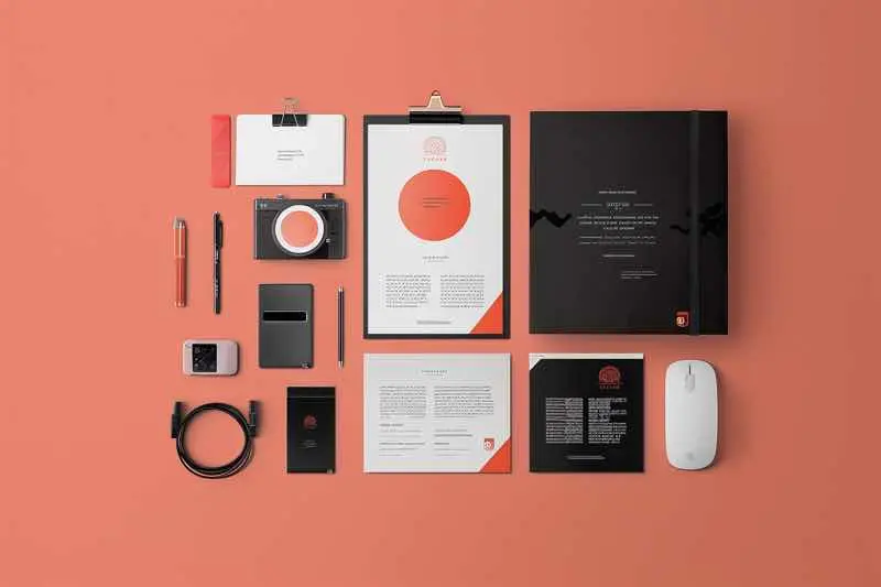
Typography plays a crucial role in graphic design, enhancing visual appeal and conveying messages effectively. In this article, we explore five stunning examples of typography in graphic design, showcasing how leading brands utilize typography to create impactful designs that resonate with their audience.
Table of Contents
ToggleKey Takeaways
- Typography is a fundamental element of graphic design that can elevate the overall visual impact of a design.
- Bold and experimental typography is a growing trend, offering designers the opportunity to push boundaries and create unique typefaces.
- Typography should be integrated harmoniously with other design elements to maintain visual hierarchy and enhance the overall aesthetic appeal.
- Selecting the right typography size is essential for ensuring readability and clarity in graphic designs across different devices.
- Incorporating realistic textures into typography and illustrations can add depth and visual interest to graphic design visuals.
Examples of Typography in Graphic Design #1: The New York Times

When it comes to typography, The New York Times stands out with its iconic use of typefaces that evoke a sense of tradition and credibility. The newspaper’s mastery of typography is not just about aesthetics; it’s a blend of form and function that enhances readability and conveys authority.
- Times New Roman: A classic that needs no introduction.
- Euclid Circular: For a modern twist, pairing with Times New Roman.
- Montserrat & Courier New: A duo that marries the old with the new.
The New York Times’ typographic choices are a lesson in balancing classic appeal with contemporary needs. The serif font Times New Roman is so ubiquitous and deeply associated with the publication that it’s become a benchmark for conveying reliability. Meanwhile, the addition of Euclid Circular offers a refreshing contrast with its simple lines and open feel. The combination of Montserrat’s sleek sans-serif with the typewriter-esque Courier New creates a nostalgic yet forward-looking vibe, perfect for brands that span the historical spectrum.
The key to typographic success is in the subtle details that command respect without overshadowing the content. The New York Times exemplifies this with a typographic style that’s both recognizable and effective.
Examples of Typography in Graphic Design #2: Apple Inc.

When it comes to typography in graphic design, Apple Inc. stands out with its sleek and innovative approach. The brand’s commitment to simplicity and elegance is evident in its use of typography, which is as functional as it is beautiful. Apple’s design ethos is not just about the products, but also about the user experience, which is greatly enhanced by their typographic choices.
- Minimalism: A key feature in Apple’s design, using whitespace effectively to create a clean look.
- San Francisco Typeface: Apple’s custom font designed for clarity and readability across all devices.
- Consistency: Maintaining a cohesive brand image through uniform typography.
Apple’s typographic design is not just about aesthetics; it’s about creating an intuitive and seamless user experience. This philosophy is reflected in everything from their website to product packaging, ensuring that every touchpoint with the customer communicates the Apple brand effectively.
By embracing trends like high contrast and bold typography, Apple continues to lead in design innovation. Their work is a testament to the power of typography in branding and the user interface, influencing designers and consumers alike.
Examples of Typography in Graphic Design #3: Coca-Cola

When it comes to iconic typography, Coca-Cola’s curvaceous script is instantly recognizable around the globe. The fluidity of the letters reflects the brand’s longstanding history of refreshment and joy. Here’s why Coca-Cola’s typography remains a classic in graphic design:
- Consistency: The logo has remained largely unchanged since the 1880s, making it a staple of visual identity.
- Simplicity: Despite its ornate script, the logo is simple enough to be memorable.
- Versatility: It adapts well across various media, from billboards to digital screens.
Coca-Cola’s typeface is not just a logo; it’s a symbol of shared experiences and timeless branding.
For those looking to emulate such iconic design, remember that tools like GIMP, Inkscape, and Gravit Designer offer free solutions. And for a deeper dive into branding, exploring examples like ‘17 Brand Guide Examples to Help You Stand Out – Digifloat’ can provide valuable insights into creating a cohesive brand identity.
Examples of Typography in Graphic Design #4: Nike

When it comes to typography in graphic design, Nike never just does it—they do it with style. The brand’s approach to typography is as dynamic as their slogan, “Just Do It.” Inspiration, innovation, and empowerment are not just buzzwords for Nike; they are the pillars of their brand identity, reflected in every curve and line of their typefaces.
Graphic designer Neville Brody’s collaboration with Nike to create a typography for the England women’s football kit is a prime example. The design is described as “modular and slightly industrial,” paying homage to the original Wembley Stadium’s art deco origins. This blend of historical reference with modern aesthetics is what keeps Nike at the forefront of design.
Nike’s typographic choices often mirror the qualities they wish to evoke in their audience: boldness, agility, and a touch of rebellion.
Whether it’s the iconic swoosh logo or the sharp, clean lines of their latest campaign, Nike’s typographic decisions are always on point. They understand that the right font can speak volumes, and they’ve mastered the art of using typography to amplify their message.
Examples of Typography in Graphic Design #5: IBM

When it comes to typography in graphic design, IBM stands as a pioneer with its distinct typographic identity. Bold and functional, IBM’s typeface reflects its legacy in the tech industry. The font is not just a style choice; it’s a statement of precision and innovation.
- IBM’s typography is used across various mediums, from their website to product interfaces.
- The typeface is designed to be highly legible, even in less-than-ideal conditions.
- It conveys a sense of reliability and professionalism that aligns with IBM’s brand values.
IBM’s typographic choices are not just about aesthetics; they are a strategic tool that enhances brand recognition and communicates the company’s commitment to excellence.
IBM’s typography is a lesson in how a well-chosen font can embody the essence of a brand. It’s a blend of art and engineering, much like the company itself. The typeface is a crucial part of IBM’s visual identity, helping it stand out in a crowded tech landscape.
Conclusion
In conclusion, typography plays a crucial role in graphic design, adding depth, personality, and character to visual creations. From bold and experimental fonts to the incorporation of realistic textures, the world of typography is constantly evolving.
By leveraging design tools and understanding the importance of typography size and hierarchy, designers can create stunning and impactful designs that stand out in a crowded digital landscape. So, next time you embark on a design project, remember that typography is not just about letters and words—it’s about creating a visual language that speaks volumes.
FAQs
What is the importance of typography in graphic design?
Typography plays a crucial role in graphic design as it conveys the message, sets the tone, and enhances the overall visual appeal of the design.
How can typography be used in different design projects?
Typography can be used in various design projects such as websites, product packaging, branding, print materials, and more to create a cohesive and engaging visual experience.
What are some trends in typography and graphic design?
Some current trends in typography and graphic design include experimental and bold typography, minimalist design, use of color accents, and integration of typography with other design elements.
How can typography enhance brand identity?
Typography can help establish a strong brand identity by conveying the brand’s personality, values, and uniqueness through the choice of fonts, styles, and layouts.
What are some key considerations for typography in graphic design?
Key considerations for typography in graphic design include font selection, sizing for clarity, maintaining visual hierarchy, emphasizing key messages, and integrating typography with other design elements effectively.
How can illustrations with realistic textures enhance graphic design visuals?
Incorporating realistic textures into illustrations can add depth, realism, and tactile appeal to graphic design visuals, creating a more immersive and engaging experience for viewers.
