In this article, we will explore essential UI design principles that every designer should know. These principles will help you create attractive and user-friendly interfaces that enhance the overall user experience. From understanding the importance of visual hierarchy to designing for accessibility, we will cover a wide range of topics. So let’s dive in and discover the key principles that will elevate your UI design skills.
Key Takeaways
- Understanding the importance of visual hierarchy
- Creating a clear and effective visual hierarchy
- Using contrast to guide user attention
- Embracing minimalism in UI design
- Streamlining user interfaces for better usability
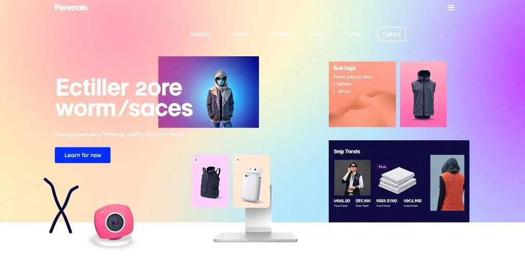
UI Design Principles: The Power of Visual Hierarchy

Understanding the Importance of Visual Hierarchy
Establish a visual hierarchy to guide users through the interface. Important elements should stand out, guiding users’ attention and helping them navigate seamlessly.
Simplicity: Less is often more in UI design. Avoid clutter and unnecessary complexity, opting for a clean and simple design that prioritizes the user’s needs.
Feedback: Provide users with instant feedback to their actions. Whether it’s a button press or a form submission, feedback helps users understand that their actions are registered, creating a more responsive and engaging experience.
Tools of the Trade: UI design involves the careful selection of colors, typography, and layout. Use these tools strategically to create a visually appealing and user-friendly interface.
Remember, in the world of UI design, visual hierarchy is the guiding light that leads users to a seamless and delightful experience.
Creating a Clear and Effective Visual Hierarchy
Establish a visual hierarchy to guide users through the interface. Important elements should stand out, guiding users’ attention and helping them navigate seamlessly. Less is often more in UI design. Avoid clutter and unnecessary complexity, opting for a clean and simple design that prioritizes the user’s needs.
Provide users with instant feedback to their actions. Whether it’s a button press or a form submission, feedback helps users understand that their actions are registered, creating a more responsive and engaging experience. Clarity and consistency are key in UI design. Elements such as buttons, icons, and fonts should maintain a uniform style throughout the interface, ensuring users can easily predict how elements will behave.
Using Contrast to Guide User Attention
When designing a user interface, contrast is crucial for creating a visually appealing and effective display. Using contrasting colors can help make the information on the screen more easily readable and visible to users. Also, you can use contrast to draw attention to important elements such as call-to-action buttons or links. Contrast isn’t just limited to colors either — you can also create it through the use of different shapes and sizes.
Implementing contrast in your UI design can have several benefits:
- Improved Readability: Contrasting colors make text and other content stand out, making it easier for users to read and understand.
- Visual Hierarchy: By using contrast, you can guide users’ attention to the most important elements on the screen, helping them navigate and interact with the interface.
- Enhanced User Experience: Contrast can create a more engaging and memorable user experience, making your interface visually appealing and enjoyable to use.
Remember, when using contrast, it’s important to strike a balance and ensure that the design remains visually cohesive and harmonious. So go ahead, play with colors, shapes, and sizes to create a UI that grabs attention and delights users!
UI Design Principles: The Art of Simplicity

Embracing Minimalism in UI Design
When it comes to UI design, sometimes less is more. Embracing minimalism can lead to a cleaner and more user-friendly interface. By removing unnecessary clutter and complexity, you can prioritize the user’s needs and create a seamless experience. Here are a few key principles to keep in mind:
- Simplicity: Simplify your design by focusing on the main functions that users want. A sleek and intuitive design allows users to easily navigate and understand the functionality without feeling overwhelmed.
- White Space: Incorporate white spaces to help elements stand out and make it easier for users to consume information.
- Consistent Typography: Stick to one clear and legible font that aligns with your brand. Consistent typography enhances readability and maintains a cohesive visual identity.
- Design Systems: Implement design systems to provide predictable controls and familiar signposts. This helps users follow the interface and understand how to interact with it.
Remember, a minimalist approach can create a visually appealing and user-centric design that enhances the overall user experience.
Streamlining User Interfaces for Better Usability
When it comes to user interfaces, simplicity is key. Embracing minimalism in UI design can greatly enhance usability and improve the overall user experience. By streamlining the interface and removing unnecessary clutter, users can easily navigate and understand the functionality without feeling overwhelmed.
The minimalist approach focuses on creating an intuitive pathway for users to achieve their goals with minimum effort. Efficient navigation enhances usability, reduces user frustration, and ultimately leads to a more enjoyable user experience.
UI Design Principles: The Role of Consistency

Maintaining Consistent Design Patterns
Consistency is key when it comes to design patterns. A consistent interface fosters familiarity and ease of use. Consistency extends to color schemes, typography, and the placement of common elements. Maintaining consistency across platforms is exemplified by Google’s Material Design.
The design system ensures a unified look and feel across Android devices, web applications, and other platforms. Responsive Design is also crucial in today’s world of various devices and screen sizes. Your UI should adapt seamlessly to different screen sizes, resolutions, and orientations.
Using Consistent Typography and Color Schemes
Consistency is key when it comes to UI design. By utilizing a consistent palette of hues, typefaces, spacing, iconography, and more throughout your design, you can create a cohesive and user-friendly interface. Choosing the right colors sets up a strong foundation for your UI design. In this process, you must select primary, secondary, and accent colors. Those colors can be used to create contrast and draw attention to important elements such as call-to-action buttons or links. Contrast isn’t just limited to colors either — you can also create it through the use of different shapes and sizes.
To ensure a polished and professional look, typography plays a crucial role. Poor typography can make your interface look cluttered and difficult to understand, while appropriate typography can make it more polished and professional. Stick to one font and choose one that is clear, legible, and aligns with your brand.
In summary, here are some key points to remember:
- Utilize a consistent palette of hues, typefaces, spacing, and iconography throughout your design.
- Choose primary, secondary, and accent colors to create contrast and draw attention to important elements.
- Use different shapes and sizes to create visual contrast.
- Stick to one clear and legible font that aligns with your brand.
UI Design Principles: The Importance of User Feedback

Providing Clear and Timely Feedback
It’s important to let your users know that the actions they took have been completed; if something has gone wrong, they should be told that too. Don’t keep them guessing if the action they took went through! Frequent actions can be given simple acknowledgement, and important or rare actions warrant more elaborate feedback. Instant feedback reassures users.
For example, when a user clicks on add to cart, a checkmark icon, or ‘item added to cart’ can be displayed, and the user knows the action was successful.
When people share their thoughts on what a digital tool is up to, it helps designers create products, following the design thinking process that acts as users expect and solves their pain points. Make sure the UX and UI design agencies give accurate and real-time updates on actions, downloads, and processes. Use progress bars, loading signs, or messages to tell users what’s happening. This keeps users in the loop and reduces confusion.
Trying to please everyone can lead to a diluted, ineffective design. Instead, focus on your core audience and design with their needs in mind. Consider accessibility and inclusivity in your design choices to ensure that all users can easily navigate and interact with your product.
Using Microinteractions to Enhance User Experience
Microinteractions are small, subtle animations or feedback mechanisms that can have a big impact on user experience. They provide users with immediate confirmation of their actions, reducing user frustration and encouraging engagement. Whether it’s a subtle animation when sending a message or a notification sound, microinteractions make the user interface more responsive and user-friendly. Regular usability testing is essential to gather feedback on the usability and effectiveness of microinteractions. By implementing microinteractions effectively, designers can create a more intuitive and enjoyable user experience.
UI Design Principles: Emotional Design

Creating an Emotional Connection with Users
When it comes to UI design, creating an emotional connection with users is key. It’s not just about making the interface visually appealing, but also about evoking emotions that resonate with the users. By understanding the psychology behind user emotions, designers can create interfaces that elicit positive feelings and enhance the overall user experience.
So how can you create that emotional connection? Here are a few strategies:
- Use storytelling: Incorporate storytelling elements into your design to engage users on a deeper level. By telling a compelling story through your interface, you can evoke emotions and create a memorable experience.
- Leverage color psychology: Colors have the power to evoke specific emotions. Use color psychology to your advantage by choosing colors that align with the emotions you want to evoke in your users.
- Add delightful surprises: Surprise and delight your users with unexpected interactions or animations. These small moments of delight can create a positive emotional response and make the interface more memorable.
Remember, creating an emotional connection with users is not just about aesthetics. It’s about understanding the impact of emotions on the user experience and designing interfaces that resonate with users on a deeper level.
Using Visual Elements to Evoke Emotions
Visual elements play a crucial role in UI design, as they have the power to evoke emotions and create a memorable user experience. One of the key aspects of visual storytelling in UI/UX design is the use of color and typography. Colors can evoke specific emotions and set the overall mood of the interface, while typography can convey personality and enhance the visual aesthetics. By carefully selecting the right colors and typography, designers can create a design that resonates with users and elicits the desired emotional response.
In addition to color and typography, highly detailed illustrations also contribute to the emotional impact of a design. These intricate visuals go beyond mere decoration and add a layer of sophistication to the overall design. They captivate users and make the interface visually compelling. From product descriptions to narrative elements, detailed illustrations can enhance the storytelling aspect of UI design and create a more engaging user experience.
To create a visually appealing design, it is important to prioritize clean and tidy layouts. Minimalistic designs with ample whitespace and organized typography not only enhance the visual aesthetics but also improve usability. Users appreciate simplicity and ease of navigation, and clean layouts provide a clear and focused user interface.
In summary, visual elements such as color, typography, and illustrations play a significant role in evoking emotions and creating a memorable user experience. By carefully selecting and incorporating these elements, designers can create designs that resonate with users and leave a lasting impression.
UI Design Principles: Role of Accessibility

Designing for All Users
Designing for all users is a crucial aspect of creating a successful UI. While it may be tempting to try and please everyone, this can often result in a diluted and ineffective design. Instead, it’s important to focus on your core audience and design for their specific needs, preferences, and behaviors. By taking an exclusive and targeted approach, you can create a more compelling and personalized user experience for your primary user base.
To prioritize accessibility, incorporate features like alt text for images, proper color contrast, and keyboard navigation. This ensures that your interface is accessible to users with diverse abilities and complies with legal requirements. Broadening your user base not only promotes inclusivity but also opens up new opportunities for your product.
Remember, user feedback is invaluable, but it’s not always the final word. As a designer, it’s important to balance user feedback with your own innovation and vision. Be willing to take calculated risks and introduce users to new and improved ways of interacting with your product.
Consistency is key in design, but a little variety can spark delight and interest. While maintaining a coherent experience, consider incorporating occasional unexpected animations, unique content layouts, or varied storytelling. This adds a touch of excitement and keeps users engaged.
When designing for all users, it’s essential to test your design across devices to ensure flexibility and responsiveness. Additionally, build learnability into your design so that new users can easily familiarize themselves with your product, while also providing accelerators for experienced users to complete tasks quickly.
Embracing a minimalistic approach in UI design is also crucial. Whether it’s the appearance or the steps required to complete tasks, reducing clutter and streamlining the user interface enhances usability. By prioritizing essential information and removing unnecessary elements, you create a clean and focused experience for your users.
Ensuring Accessibility Compliance
Make your interface accessible to users with diverse abilities. Incorporate features like alt text for images, proper color contrast, and keyboard navigation. Following accessibility human interface guidelines not only ensures inclusivity but also complies with legal requirements, broadening your user base. Every element, whether images, text, or icons, must scale proportionately to provide accessibility to all users and deliver impactful experiences. Voice-based interactions can provide accessibility to disabled users.
Using dynamic type ensures that fonts scale so that it is always readable. It is critical to test your design across devices to verify that there are no flexibility issues. Build learnability into the design so that new users are able to familiarize themselves with the use of your product, but also include accelerators that help experienced users complete their tasks quickly.
The Role of Accessibility is crucial in today’s digital world. It ensures that everyone, regardless of their abilities, can access and use websites, applications, and other digital platforms. Accessibility is not just about compliance with legal requirements, but also about creating an inclusive and user-friendly experience for all users.
At CWORKS, we understand the importance of accessibility and strive to make our website and services accessible to everyone. Contact us now through our contact page to discuss your business needs and achieve remarkable success together with CWORKS. Let’s get started!
In Conclusion
UI design is a fascinating field that combines creativity and functionality to create visually appealing and user-friendly interfaces. By understanding and applying the essential UI design principles discussed in this article, you can elevate your design skills and create exceptional user experiences. Remember, contrast is key, simplicity is powerful, and consistency is king. So go forth, embrace these principles, and design with purpose and flair!
FAQs
What is visual hierarchy?
Visual hierarchy is the arrangement and prioritization of elements in a design to guide the user’s attention and create a clear and effective layout.
How can I create a clear and effective visual hierarchy?
To create a clear and effective visual hierarchy, you can use techniques such as size, color, contrast, and placement to differentiate and emphasize important elements.
What is the role of contrast in visual hierarchy?
Contrast plays a crucial role in visual hierarchy as it helps to distinguish and highlight elements by using differences in color, size, or shape.
What is the importance of simplicity in UI design?
Simplicity in UI design helps to create a clean and intuitive interface that is easy for users to understand and navigate.
How can I embrace minimalism in UI design?
To embrace minimalism in UI design, focus on removing unnecessary elements, simplifying visual elements, and prioritizing content and functionality.
Why is consistency important in UI design?
Consistency in UI design helps to create a familiar and predictable experience for users, reducing confusion and improving usability.


![A Comprehensive Guide to Google Play Console Pricing [n8n]](https://cworks.id/wp-content/uploads/2025/09/cover-image-24622.avif)
![Understanding the Google Play Console Price: What Developers Need to Know [arvow]](https://cworks.id/wp-content/uploads/2025/05/4755037cthumbnail.avif)


 EN
EN  ID
ID