In the digital landscape, maximizing conversion rates on landing pages is crucial for businesses to achieve their marketing goals. Understanding the essential functions of a landing page is key to capturing and retaining the attention of visitors. This article explores the core elements that contribute to the effectiveness of a landing page, from crafting a captivating headline to optimizing for mobile responsiveness.
Key Takeaways
- Crafting a compelling headline is essential to grab the attention of visitors and entice them to explore further.
- Choosing the right color scheme for your call-to-action button can significantly impact user engagement and conversion rates.
- Simplifying navigation for thumb-friendly interaction on mobile devices can enhance the user experience and drive conversions.
- Creating a sense of urgency in your headline or call-to-action can prompt visitors to take immediate action, leading to higher conversion rates.
- Ensuring fast loading speeds on mobile devices is critical to prevent user frustration and abandonment, ultimately improving conversion rates.
Functions of a Landing Page: Generating Leads

The Power of a Compelling Hook
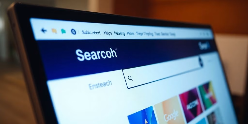
One of the functions of a landing page is to capture the right audience A landing page is the front line of your digital marketing efforts, and the headline is its commander-in-chief. A well-designed landing page can captivate visitors and compel them to take the desired action, such as making a purchase or filling out a form. Crafting a headline that acts as a compelling hook is not just about being clever; it’s about understanding the psychology of your audience.
The headline should be a beacon that guides the visitor through the noise of the internet, straight to the heart of what they seek.
To achieve this, consider the following points:
- Identify the core benefit your product or service offers and make it the star of your headline.
- Use language that resonates with your audience’s desires and pain points.
- Test different headlines to see which one drives the most engagement.
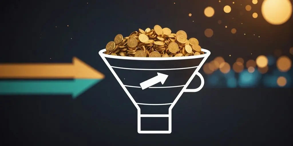
Remember, the goal is to increase the conversion rate, which is the percentage of visitors who complete the desired action on the page after landing on it. Higher conversion rates indicate your landing page is doing its job effectively.
Using Emotional Triggers
Harnessing the power of emotional triggers can significantly amplify the impact of your landing page. This increases the likelihood that people will convert, and conversion is one of the primary functions of a landing page. People make decisions based on emotions, not just facts. By tapping into the right feelings, you can guide visitors toward taking action. Consider the basic emotions such as joy, trust, fear, and anticipation to create a connection with your audience.
- Joy encourages sharing and engagement.
- Trust builds credibility and loyalty.
- Fear can motivate action to avoid negative outcomes.
- Anticipation creates eagerness for what’s coming next.
Crafting your message to resonate emotionally can transform passive readers into active participants. It’s not just about presenting the benefits of your product or service, but about weaving a narrative that aligns with the aspirations and concerns of your potential customers.
Creating a Sense of Urgency
It is no secret that urgency is a factor in decision making. In the fast-paced world of online marketing, creating a sense of urgency can be the difference between a user bouncing and converting. By suggesting that an offer is limited, you tap into the customer’s fear of missing out, or FOMO. This psychological trigger can effectively coax users into taking immediate action.
Urgency should be used judiciously to avoid customer fatigue. Overuse can lead to skepticism and a loss of trust.
Here are a few tactics to induce urgency on your landing page:
- Highlight limited-time offers with a countdown timer
- Showcase the dwindling stock levels for products
- Use urgent language in your CTA, like ‘Act Now’ or ‘Limited Offer’
Remember, the goal is to make the user feel that they have something valuable to gain by acting promptly, and potentially something to lose if they don’t.
Functions of a Landing Page: Providing Information Easily

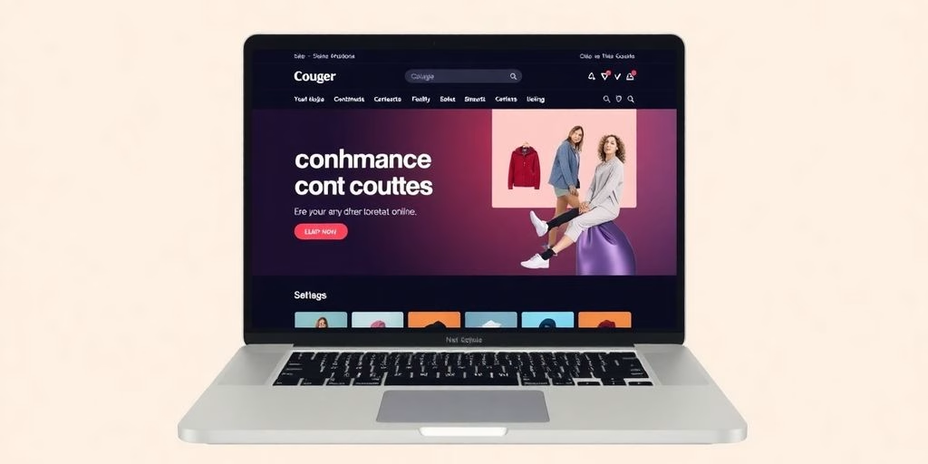
Choosing the Right Color Scheme
When it comes to conversion, never underestimate the power of the right color palette. Colors can evoke emotions and actions—a red that screams ‘Buy Now!’ or a blue that soothes and builds trust. Color also triggers specific meaning, and thus psychologically it delivers a message into the viewers’ minds. This is one of the functions of a landing page, to provide the right sense of information.
But it’s not just about picking your favorite shade; it’s about understanding the psychology behind color choices and how they interact with your brand identity.
- Red: Urgency and excitement, often used to stimulate quick decisions.
- Blue: Trust and security, preferred by banks and social networks.
- Green: Health and tranquility, a go-to for eco-friendly products.
- Yellow: Optimism and attention-grabbing, but use sparingly to avoid overwhelming.
- Orange: Aggressive yet friendly, a balance between red’s intensity and yellow’s cheer.
Remember, consistency is key. Your color scheme should complement your overall design and not clash with it. A harmonious visual experience keeps users engaged and reduces bounce rates.
Choosing the right color scheme is not just about aesthetics; it’s a strategic move that can significantly impact user behavior. A user-friendly interface that incorporates thoughtful color choices can subtly guide visitors towards making a purchase, capitalizing on the impulse driven by a fear of missing out (FOMO) in the ecommerce space.
Placement Matters
While the color and copy of your call-to-action (CTA) are crucial, placement can make or break its effectiveness. Think of your CTA as a shy celebrity at a party—it needs to be visible without being obnoxious, accessible without being omnipresent. Effective impact is one of the functions of a landing page. Here’s a quick guide to ensure your CTA finds its sweet spot:
- Above the fold: Ensure your CTA is visible without scrolling. This prime real estate is where eyes land first.
- Near the content’s climax: Place your CTA where engagement peaks, typically after delivering a compelling benefit.
- In the pathway of natural reading flow: For English-speaking audiences, the bottom right corner aligns with the direction of reading.
Remember, a CTA that’s hard to find is like a door with no handle—frustrating and ultimately useless. Optimize your landing page by placing the CTA where it naturally draws the eye and invites action.
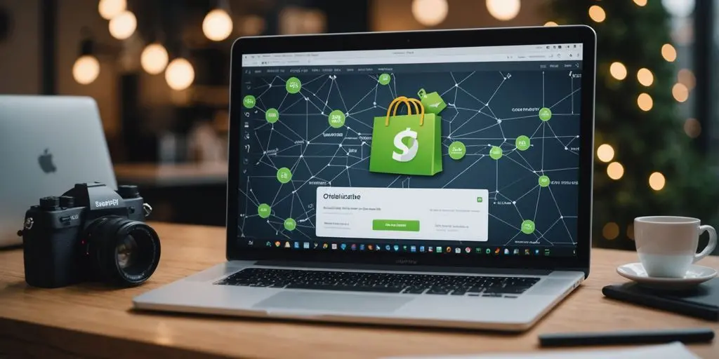
Incorporating Persuasive Copy
The art of persuasion is subtle yet powerful. To deliver the right message and connect to users emotionally is one of the functions of a landing page. Crafting copy that speaks directly to the heart of your audience can transform a passive reader into an active participant. Words are the gateway to emotions, and the right ones can lead to a flurry of conversions. Remember, persuasive copy doesn’t just inform; it entices, excites, and convinces.
Persuasive copywriting is a critical component of effective ecommerce website design. It charms visitors with a clear, professional layout and a user-friendly interface, while also building trust. This approach not only shares information but also encourages impulse purchases through strategic recommendations and persuasive elements.
To maximize the impact of your copy, focus on the benefits rather than the features. Highlight what your product or service can do for the customer, not just what it is.
Here are a few key strategies to enhance your persuasive copy:
- Use active voice to create a sense of immediacy.
- Incorporate sensory words to paint a vivid picture.
- Leverage social proof to build credibility.
- Craft a narrative that resonates with your audience’s desires.
Functions of a Landing Page: Responsive Broadcast

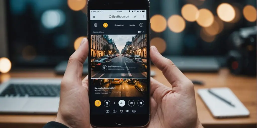
Simplifying Navigation for Thumb-Friendly Interaction
In the realm of mobile optimization, simplifying navigation is akin to decluttering a busy workspace; it’s all about creating a thumb-friendly design that enhances user experience. This approach ensures that all the essential elements are within easy reach, making the journey through your landing page a breeze.
- Ensure buttons and links are large enough to be tapped with a thumb
- Group related items together to minimize search time
- Use swipe gestures for intuitive navigation
Remember, a mobile user’s patience is as limited as their screen size. A thumb-friendly interface keeps them engaged and less likely to abandon ship.
By streamlining the path to conversion, you’re not just accommodating the mobile user’s needs; you’re also building a highway to their heart—and their wallet. After all, a smooth navigation experience is a silent salesman, guiding visitors effortlessly towards that all-important call-to-action.
Ensuring Fast Loading Speeds
In the fast-paced digital world, a snail-paced landing page is the kiss of death for your conversion rates. Speed is the silent salesman that can make or break the user experience. A mere second’s delay can lead to a significant drop in engagement, skyrocketing your bounce rates to the stratosphere.
Patience is a virtue, but not when it comes to waiting for a page to load. Users expect lightning-fast responses, and anything less might as well be a ‘Closed’ sign on your website. Here’s a quick checklist to keep your loading speeds in the fast lane:
- Compress images without sacrificing quality
- Minimize HTTP requests by combining files
- Utilize browser caching for repeat visitors
- Optimize server response time
Remember, a swift landing page keeps the user’s attention where it should be: on your content and call-to-action, not on the spinning wheel of doom.
To quantify ‘fast enough,’ let’s turn to the experts. Landingi suggests that landing pages need to load fast and work smoothly. Meanwhile, the 2023 guide to increasing website loading speed emphasizes the importance of detecting and fixing issues to keep your site zippy. Both sources underscore the critical nature of speed in the user’s online experience.
Adapting Content for Smaller Screens
In the realm of mobile optimization, size does matter. The art of adapting content for smaller screens is akin to translating a novel into a haiku; it’s about capturing the essence while trimming the fat. Content must be concise, yet impactful, ensuring that every word earns its place on the screen.
- Keep paragraphs short and sweet, making them easier to digest on the go.
- Utilize bullet points to break down complex information into bite-sized pieces.
- Embrace whitespace to avoid visual clutter and enhance readability.
Remember, the goal is to deliver a seamless user experience that keeps users engaged, not overwhelmed.
By prioritizing clarity and brevity, you can craft a landing page that resonates with the mobile audience. After all, when it comes to mobile screens, less is often more.
Conclusion
In conclusion, a well-crafted landing page is the key to unlocking higher conversion rates and engaging your audience effectively. By understanding the essential functions of a landing page, such as clear call-to-actions, compelling visuals, and user-friendly design, you can maximize the potential of your online presence.
Remember, a successful landing page is not just about attracting visitors, but converting them into loyal customers. Understanding these functions of a landing page will give us a better way to reach higher. We can help! So, keep these functions in mind and watch your conversion rates soar! 🚀
FAQs
What makes a headline captivating?
A captivating headline is one that grabs the reader’s attention with a compelling hook, uses emotional triggers, and creates a sense of urgency.
Why is the color scheme important in a call-to-action?
The color scheme in a call-to-action is crucial as it can influence the user’s perception and behavior, guiding them towards taking the desired action.
How does mobile responsiveness impact conversion rates?
Mobile responsiveness is critical for conversion rates as it ensures a seamless user experience on various devices, leading to increased engagement and conversions.
What role does navigation play in mobile optimization?
Navigation is essential in mobile optimization to provide easy and thumb-friendly interaction, enabling users to navigate the landing page effortlessly.
Why is fast loading speed important for a landing page?
Fast loading speed is crucial for a landing page as it impacts user experience, bounce rates, and search engine rankings, ultimately affecting conversion rates.
How can persuasive copy enhance a call-to-action’s effectiveness?
Persuasive copy in a call-to-action can influence user behavior by creating a sense of urgency, addressing pain points, and highlighting the benefits of taking action.


![A Comprehensive Guide to Google Play Console Pricing [n8n]](https://cworks.id/wp-content/uploads/2025/09/cover-image-24622.avif)
![Understanding the Google Play Console Price: What Developers Need to Know [arvow]](https://cworks.id/wp-content/uploads/2025/05/4755037cthumbnail.avif)