Browse Our Latest Articles From Category: Graphic Design and Stay Up to Date with new thing

A colorful creative workspace with design tools and supplies. How Canva AI Transforms Your Design Experience
Branding
andre

Unleashing Creativity: How Canva AI Transforms Your Design Experience

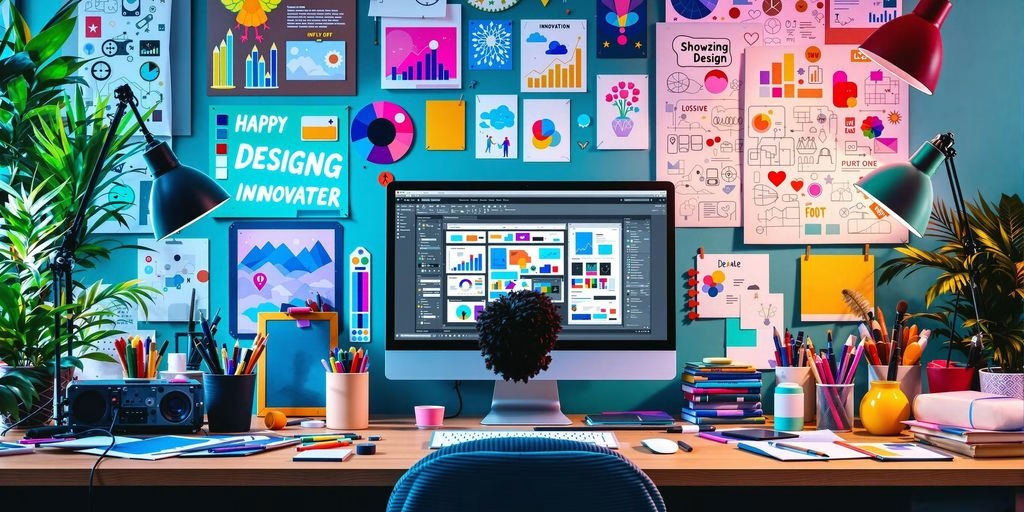
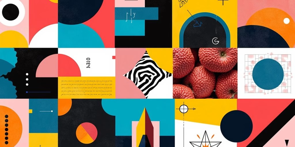
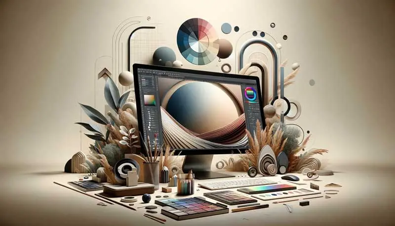
Canva AI is changing the way we think about design. With its smart tools and features, it helps everyone, from beginners to professional designers, create stunning visuals. This article explores how Canva AI makes design easier and more fun, allowing anyone to unleash their creativity. Key Takeaways Canva AI helps users create designs quickly and easily. It offers smart suggestions to improve design quality. Even beginners can make professional-looking graphics with Canva AI. Collaboration is made simple with real-time feedback features. Canva AI is shaping the future of design by making it accessible to everyone. The Evolution of Canva: Integrating AI for Enhanced Creativity From Basic Tools to AI-Powered Features Canva started as a simple design tool, but it has grown into a powerful platform. With the introduction of AI, users can now create stunning designs more easily than ever. The shift from basic features to intelligent tools has made a big difference in how people design. The Role of AI in Modern Design AI plays a crucial role in today’s design world. It helps users by: Suggesting layouts that fit their needs. Offering color palettes that work well together. Automating repetitive tasks, saving time. How Canva AI Stands Out in the Design World Canva AI is unique because it combines creativity with technology. It allows anyone, regardless of skill level, to create professional-looking designs. This blend of creativity and technology makes Canva a leader in the design space. Canva’s evolution shows how technology can enhance creativity, making design accessible to everyone. Exploring Canva AI’s Innovative Design Tools AI-Driven Templates and Layouts Canva AI offers a wide range of templates that are designed to make your projects easier. With just a few clicks, you can choose from various styles that fit your needs. These templates help you save time and ensure your designs look professional. Smart Design Suggestions with Canva AI One of the coolest features of Canva AI is its ability to provide smart design suggestions. It analyzes your work and gives you tips on how to improve it. Here are some benefits of using these suggestions: Helps you find the right colors Suggests fonts that match your style Offers layout ideas to enhance your design Enhancing Visual Appeal with AI-Powered Elements Canva AI also includes special elements that can make your designs pop. You can add graphics, icons, and images that are tailored to your project. For example, with the AI interior design feature, you can transform empty or furnished spaces into stunning interiors with Canva. Just upload a picture of your room, choose a design style, and reimagine your interior space. Canva AI tools are designed to make creativity accessible to everyone, regardless of their design skills. In summary, Canva AI’s innovative design tools are changing the way we create. They not only save time but also help you produce high-quality work effortlessly. Whether you’re making a presentation or designing a social media post, these tools can help you shine. For instance, you can create slides in seconds with the magical design tool for presentations, ensuring brand consistency and a polished look. Streamlining the Design Process with Canva AI Canva AI is changing how we design by making the process faster and easier. With AI, repetitive tasks can be automated, allowing designers to focus on creativity instead of mundane details. Automating Repetitive Tasks Quickly resize designs for different platforms. Automatically adjust colors and fonts to match your brand. Generate multiple design variations in seconds. Improving Workflow Efficiency Using Canva AI helps improve how teams work together. Here are some benefits: Instant feedback on designs from team members. Easy sharing of designs for collaboration. Access to a library of templates that save time. Real-Time Collaboration and Feedback Canva AI allows for real-time teamwork. This means: Everyone can see changes as they happen. Team members can leave comments directly on the design. It’s easier to make adjustments based on feedback. By using Canva AI, designers can create high-quality work while saving time and effort. This makes the design process smoother and more enjoyable for everyone involved. Canva AI for Non-Designers: Making Creativity Accessible User-Friendly Interface for Beginners Canva AI is designed to be easy for everyone, even if you have no design experience. The platform offers a simple layout that helps users navigate through various tools without feeling overwhelmed. This makes it possible for anyone to start creating right away. AI-Powered Guidance and Tips With Canva AI, users receive helpful suggestions as they design. This includes: Smart tips on color combinations Layout recommendations that fit your content Automatic adjustments to improve your design’s look These features ensure that even those without a design background can create stunning visuals. Canva AI acts like a personal assistant, guiding you through the design process. Creating Professional Designs Without Expertise Thanks to Canva AI, anyone can produce high-quality designs. Here are some ways it helps: Templates: Choose from thousands of ready-made templates that suit various needs. Brand Kit: Easily create on-brand images with AI by using your brand kit photos as a guide. Customization: Modify templates to fit your style without needing advanced skills. Canva AI truly opens the door for creativity, allowing non-designers to express themselves visually without the usual barriers. In summary, Canva AI makes design accessible to everyone, empowering users to create beautiful graphics with ease. Whether you’re a student, a small business owner, or just someone who loves to create, Canva AI is here to help you shine! The Impact of Canva AI on Professional Designers Elevating Design Quality with AI Canva AI is changing the way professional designers work. With its smart tools, designers can create stunning visuals faster than ever. This technology helps to enhance creativity by providing suggestions and automating tasks. Here are some ways Canva AI elevates design quality: Offers intelligent design suggestions Provides access to a wide range of templates Helps in color and font selection Balancing Creativity and Automation While automation is helpful, it’s important for designers to maintain their unique style.

Read More »
7 Fresh Innovative Graphic Design Examples; Colorful graphic design elements in a creative collage.
Branding
andre

Elevate Your Designs: 7 Fresh Innovative Graphic Design Examples

Graphic design is a vibrant field that constantly evolves with new ideas and trends. Whether you’re a beginner or a seasoned designer, finding inspiration can help you create stunning visuals. In this article, we explore various innovative graphic design concepts to spark your creativity for your next project. Key Takeaways Typography is crucial in graphic design, helping to convey messages clearly. Social media graphics should be eye-catching and consistent with branding. Effective logo design is all about simplicity and memorability. Vector graphics allow for scalable and versatile designs. Minimalist design emphasizes clarity and focus on the essential elements. Exploring the Power of Typography in Graphic Design Typography is more than just choosing fonts; it’s about communicating messages effectively. The right typography can enhance the visual appeal of your design and convey the intended message clearly. The Role of Typography in Visual Communication Typography plays a crucial role in how information is perceived. It helps in: Creating a mood: Different fonts evoke different feelings. Enhancing readability: Clear fonts make it easier for the audience to understand the content. Establishing brand identity: Unique typography can set a brand apart. Stunning Examples of Typography in Branding Here are some brands that showcase the power of typography: The New York Times: Uses classic serif fonts to convey trust and authority. Apple Inc.: Minimalist sans-serif fonts reflect modernity and innovation. Coca-Cola: The iconic script font evokes nostalgia and happiness. Nike: Bold typography emphasizes strength and motivation. IBM: Clean and professional fonts represent reliability and technology. Tips for Choosing the Right Fonts for Your Project When selecting fonts, consider the following: Know your audience: Choose fonts that resonate with your target demographic. Match the tone: Ensure the font aligns with the message you want to convey. Limit your choices: Stick to two or three fonts to maintain consistency. Test readability: Make sure your text is easy to read at various sizes. Typography is a powerful tool in graphic design. It can transform a simple message into a compelling visual story that resonates with the audience. By understanding the importance of typography, you can elevate your graphic design projects and create impactful visuals that leave a lasting impression. Mastering Social Media Graphic Design In today’s digital world, mastering social media graphic design is crucial for creating eye-catching posts that grab your audience’s attention. Here are some key areas to focus on: Creating Eye-Catching Social Media Posts Use vibrant colors and bold fonts to make your posts stand out. Incorporate high-quality images that resonate with your brand. Keep your message clear and concise to engage viewers quickly. Utilizing Graphic Design Tools for Social Media Graphic design tools are essential for simplifying the design process. Here’s what they can do: Provide templates for quick designs. Offer pre-set color schemes to maintain brand consistency. Allow easy scheduling of posts across various platforms. Consistency in Branding Across Social Media Platforms To ensure your brand is easily recognizable, follow these tips: Use the same logo and color palette across all platforms. Maintain a consistent tone and style in your graphics. Regularly update your visuals to keep them fresh and engaging. Remember, a strong brand is like a promise to your audience – one that’s delivered through every post, pin, and tweet. By focusing on these elements, you can create social media graphics that not only attract attention but also build a loyal following. Mastering graphic design is not just about aesthetics; it’s about creating a visual identity that speaks to your audience. The Art of Effective Logo Design Principles of Successful Logo Design Creating a logo is more than just drawing a picture; it’s about crafting a visual identity that represents your brand. Here are some key principles: Simplicity: A simple logo is easier to recognize and remember. Versatility: Your logo should look good on various platforms, from business cards to billboards. Relevance: It should reflect your brand’s values and message. Case Studies of Iconic Logos Let’s look at some famous logos and what makes them effective: Logo Brand Key Feature Nike Swoosh Nike Simple and memorable Apple Apple Clean design with a strong story McDonald’s McDonald’s Bright colors and familiarity Tips for Designing a Memorable Logo To create a logo that stands out, consider these tips: Focus on your audience: Understand who you are designing for. Use color wisely: Colors evoke emotions and can influence perception. Get feedback: Show your designs to others and be open to suggestions. A well-designed logo is not just an image; it’s a representation of your brand’s identity and values. It should resonate with your audience and leave a lasting impression. By following these principles and tips, you can create a logo that not only looks good but also effectively communicates your brand’s message. Remember, a logo is a crucial part of developing a unique brand identity that can lead to business success. Innovative Approaches to Vector Graphic Design Benefits of Using Vector Graphics Vector graphics are essential in graphic design due to their scalability and precision. Here are some key benefits: Scalability: Vector images can be resized without losing quality. Editability: They are easy to modify, allowing for quick adjustments. File Size: Generally, vector files are smaller than raster images, making them easier to share. Techniques for Creating Scalable Artwork To create effective vector graphics, consider these techniques: Use the Pen Tool: Mastering the pen tool is crucial for creating smooth curves and lines. Layering: Organize your artwork in layers for better control and editing. Color Management: Use a limited color palette to maintain visual harmony. Examples of Vector Graphics in Modern Design Here are some notable examples of vector graphics: Logos: Many brands use vector logos for their versatility. Illustrations: Vector illustrations are popular in digital media for their clean lines. Infographics: They are often created using vector graphics to ensure clarity and scalability. Remember, vector graphics are not just about aesthetics; they are a powerful tool for creating designs that are both functional and visually appealing. Explore the latest articles in graphic

Read More »
Display advertising mobile
Social Media Ads
andre

Display Advertising: The Revolutionary Way to Connect with Your Audience

In this digital time and age, display advertising stands out as a revolutionary way to connect with audiences. With the ability to captivate users through visually appealing ads, precisely target demographics, and measure the effectiveness of campaigns, display advertising offers a multitude of strategies for businesses to engage with potential customers. This article delves into the art and science behind successful display ads, providing insights into the latest trends and best practices that can help marketers dominate the market.   Key Takeaways Mastering display advertising visuals is crucial for attracting and retaining audience attention, with color psychology and storytelling imagery playing pivotal roles. Advanced targeting techniques, including demographic analysis, behavioral insights, and geotargeting, enable advertisers to reach the right audience at the right time. Incorporating interactivity through gamification, polls, and rich media can significantly increase user engagement and participation. Measuring ad success goes beyond click-through rates, encompassing holistic analytics, conversion tracking, and continuous improvement through A/B testing. Staying ahead in display advertising requires adaptation and innovation, with a focus on embracing new ad formats and leveraging machine learning for optimization.   Display Advertising Visuals The Psychology of Color in Ads Ever wondered why some ads seem to scream for your attention while others soothe your soul? It’s not just a stroke of luck; it’s the psychology of color at play. Colors are more than mere decorations; they’re powerful psychological tools that can significantly influence consumer behavior and decision-making. Red often signals urgency and can boost conversion rates when used for calls-to-action. Blue is the go-to for trust and reliability, making it a favorite in the financial sector. Green resonates with health and environmental consciousness, ideal for organic brands. Yellow, the color of optimism, can energize and grab the attention of window shoppers. Choosing the right color palette for your display advertising isn’t just about aesthetics; it’s a strategic move that can elevate your brand and resonate with your audience on a subconscious level. Web design influences perception through color psychology, ensuring that every hue works towards your ultimate goal: conversion.   Imagery that Tells a Story In the realm of display advertising, a picture is not just worth a thousand words—it’s a golden ticket to the consumer’s heart. Visual storytelling is the art of weaving a narrative through images, creating a tapestry that captures the essence of your brand. It’s about more than just aesthetics; it’s about crafting a visual journey that resonates with your audience on an emotional level. Emotional resonance is the cornerstone of effective visual storytelling. By tapping into the spectrum of human emotions, from joy to anticipation, brands can forge a stronger bond with their audience. This connection is not only memorable but also encourages viewers to become active participants in the brand’s narrative. Use high-quality images and videos to showcase your offerings Enrich digital platforms with visuals that reflect your brand’s vibrancy Optimize the conversion process with engaging designs By optimizing landing pages and incorporating social proof, brands can enhance the user experience, making every click a step further into their world. As we navigate the digital age, the power of storytelling through video content and data-driven advertising becomes increasingly evident. It’s not just about targeting; it’s about personalizing experiences and creating a journey that the audience wants to be a part of.   Balancing Creativity with Clarity In the realm of display advertising, the tightrope walk between creativity and clarity is a performance art. On one side, you have the allure of eye-catching designs and clever copy; on the other, the need for a message that’s crystal clear at a glance. It’s a blend that demands both innovation and simplicity. Craft compelling copy and visuals to enhance conversion rates. Use high-quality images, videos, and strategic CTAs to guide customers towards making a purchase. Cognitive fluency dictates that simplicity wins. Ads that are easy to understand and process are more likely to be effective. Remember, while it’s tempting to push the boundaries of artistic expression, your ad’s primary goal is to communicate value succinctly. Keep it simple, but never boring. Striking this balance is not just about aesthetics; it’s about creating a seamless path for the viewer to become a customer.   Display Advertising Targeting: Who’s Watching Your Ads? Demographics: Knowing Your Audience Unlocking the potential of display advertising begins with a deep dive into the mosaic of your audience’s demographics. Knowing who is on the other side of the screen is not just a matter of curiosity—it’s a strategic imperative. Imagine the power of tailoring your message so precisely that it feels like a personal invitation to each viewer. That’s the magic of demographic targeting. Demographics are more than just numbers; they’re the key to unlocking targeted messaging that resonates. Here’s how you can get started: Define your target audience: Age, gender, location, interests, and behaviors are the cornerstones of your campaign’s foundation. Gather data: Use tools like Google Analytics or Facebook Insights to transform audience understanding from guesswork into science. Create buyer personas: Craft detailed profiles that represent your ideal customers, guiding your ad creative and placement decisions. By weaving demographic threads into the fabric of your ads, you create a tapestry that is both visually appealing and strategically sound. Remember, the goal is to connect, engage, and convert. With demographic insights, your ads can become a beacon for those you most want to reach, illuminating the path to your digital doorstep.   Behavioral Insights: Predicting Clicks Unlocking the secrets of user behavior is akin to finding the holy grail of digital marketing. By analyzing the digital footprints left behind, savvy marketers can tailor their campaigns to resonate with the audience’s unspoken desires. Behavioral targeting is not just about bombarding users with ads; it’s about creating a narrative that aligns with their online journey. Understanding the user’s path to purchase is crucial. From the initial ad impression to the final click, each step is a treasure trove of data. Here’s a quick rundown of how to leverage this data: Monitor user interactions

Read More »
Examples of typography in graphic design
Graphic Design
andre

5 Stunning Examples of Typography in Graphic Design

Typography plays a crucial role in graphic design, enhancing visual appeal and conveying messages effectively. In this article, we explore five stunning examples of typography in graphic design, showcasing how leading brands utilize typography to create impactful designs that resonate with their audience.   Key Takeaways Typography is a fundamental element of graphic design that can elevate the overall visual impact of a design. Bold and experimental typography is a growing trend, offering designers the opportunity to push boundaries and create unique typefaces. Typography should be integrated harmoniously with other design elements to maintain visual hierarchy and enhance the overall aesthetic appeal. Selecting the right typography size is essential for ensuring readability and clarity in graphic designs across different devices. Incorporating realistic textures into typography and illustrations can add depth and visual interest to graphic design visuals.   Examples of Typography in Graphic Design #1: The New York Times When it comes to typography, The New York Times stands out with its iconic use of typefaces that evoke a sense of tradition and credibility. The newspaper’s mastery of typography is not just about aesthetics; it’s a blend of form and function that enhances readability and conveys authority. Times New Roman: A classic that needs no introduction. Euclid Circular: For a modern twist, pairing with Times New Roman. Montserrat & Courier New: A duo that marries the old with the new. The New York Times’ typographic choices are a lesson in balancing classic appeal with contemporary needs. The serif font Times New Roman is so ubiquitous and deeply associated with the publication that it’s become a benchmark for conveying reliability. Meanwhile, the addition of Euclid Circular offers a refreshing contrast with its simple lines and open feel. The combination of Montserrat’s sleek sans-serif with the typewriter-esque Courier New creates a nostalgic yet forward-looking vibe, perfect for brands that span the historical spectrum. The key to typographic success is in the subtle details that command respect without overshadowing the content. The New York Times exemplifies this with a typographic style that’s both recognizable and effective.   Examples of Typography in Graphic Design #2: Apple Inc. When it comes to typography in graphic design, Apple Inc. stands out with its sleek and innovative approach. The brand’s commitment to simplicity and elegance is evident in its use of typography, which is as functional as it is beautiful. Apple’s design ethos is not just about the products, but also about the user experience, which is greatly enhanced by their typographic choices. Minimalism: A key feature in Apple’s design, using whitespace effectively to create a clean look. San Francisco Typeface: Apple’s custom font designed for clarity and readability across all devices. Consistency: Maintaining a cohesive brand image through uniform typography. Apple’s typographic design is not just about aesthetics; it’s about creating an intuitive and seamless user experience. This philosophy is reflected in everything from their website to product packaging, ensuring that every touchpoint with the customer communicates the Apple brand effectively. By embracing trends like high contrast and bold typography, Apple continues to lead in design innovation. Their work is a testament to the power of typography in branding and the user interface, influencing designers and consumers alike.   Examples of Typography in Graphic Design #3: Coca-Cola When it comes to iconic typography, Coca-Cola’s curvaceous script is instantly recognizable around the globe. The fluidity of the letters reflects the brand’s longstanding history of refreshment and joy. Here’s why Coca-Cola’s typography remains a classic in graphic design: Consistency: The logo has remained largely unchanged since the 1880s, making it a staple of visual identity. Simplicity: Despite its ornate script, the logo is simple enough to be memorable. Versatility: It adapts well across various media, from billboards to digital screens. Coca-Cola’s typeface is not just a logo; it’s a symbol of shared experiences and timeless branding. For those looking to emulate such iconic design, remember that tools like GIMP, Inkscape, and Gravit Designer offer free solutions. And for a deeper dive into branding, exploring examples like ‘17 Brand Guide Examples to Help You Stand Out – Digifloat’ can provide valuable insights into creating a cohesive brand identity.   Examples of Typography in Graphic Design #4: Nike When it comes to typography in graphic design, Nike never just does it—they do it with style. The brand’s approach to typography is as dynamic as their slogan, “Just Do It.” Inspiration, innovation, and empowerment are not just buzzwords for Nike; they are the pillars of their brand identity, reflected in every curve and line of their typefaces. Graphic designer Neville Brody’s collaboration with Nike to create a typography for the England women’s football kit is a prime example. The design is described as “modular and slightly industrial,” paying homage to the original Wembley Stadium’s art deco origins. This blend of historical reference with modern aesthetics is what keeps Nike at the forefront of design. Nike’s typographic choices often mirror the qualities they wish to evoke in their audience: boldness, agility, and a touch of rebellion. Whether it’s the iconic swoosh logo or the sharp, clean lines of their latest campaign, Nike’s typographic decisions are always on point. They understand that the right font can speak volumes, and they’ve mastered the art of using typography to amplify their message.   Examples of Typography in Graphic Design #5: IBM When it comes to typography in graphic design, IBM stands as a pioneer with its distinct typographic identity. Bold and functional, IBM’s typeface reflects its legacy in the tech industry. The font is not just a style choice; it’s a statement of precision and innovation. IBM’s typography is used across various mediums, from their website to product interfaces. The typeface is designed to be highly legible, even in less-than-ideal conditions. It conveys a sense of reliability and professionalism that aligns with IBM’s brand values. IBM’s typographic choices are not just about aesthetics; they are a strategic tool that enhances brand recognition and communicates the company’s commitment to excellence. IBM’s typography is a lesson

Read More »
Vektor image
Graphic Design
andre

Vector in Graphic Design: Scalable Artwork

Vector artwork is a powerful tool for digital artists and graphic designers, allowing for precise control over anchor points, curves, and paths. It is highly scalable and versatile, making it ideal for various design projects across different mediums. In this article, we will explore the benefits of incorporating vector in graphic design and how scalable artwork enhances the design process and quality of visual elements.   Key Takeaways Vector in graphic design offers precise control over anchor points, curves, and paths, making it ideal for graphic design projects. Scalable vector in graphic design allows for versatile and adaptable designs across different mediums and sizes. Understanding the strengths of vector in graphic design versus raster graphics is essential for balancing quality and efficiency in design work. SVG images provide scalability without compromising quality, making them ideal for web design and visual effects. Efficient design processes can be achieved through the use of vector editing tools like Sketch’s artboards and symbols.   Unleashing the Power of Vector in Graphic Design Creating Versatile Designs with Vector Graphics Vector in graphic design are the Swiss Army knife of design, offering unparalleled versatility and ease of manipulation. They can be scaled up or down without losing quality, making them perfect for everything from tiny icons to massive billboards. With vector graphics, you’re not just creating images; you’re crafting blueprints that can adapt to any context. Precision: Vector graphics are defined by points, curves, and paths, allowing for crisp, clean lines no matter the scale. Consistency: Maintain the same high quality across different mediums, from digital to print. Flexibility: Easily tweak colors, shapes, and layouts to suit different design needs. Vectorization in graphic design isn’t just about scalability; it’s about creating a foundation for designs that stand the test of time and technology. Whether you’re working on logo design, typography, or web graphics, vector software like Adobe Illustrator or Inkscape gives you the power to create adaptable designs. These tools ensure that your artwork remains sharp and professional, no matter where it’s displayed.   Mastering Precision with Anchor Points The anchor point is the cornerstone of vector design, acting as a pivot for the paths that define your artwork. Mastering the Pen Tool in applications like Adobe Illustrator is akin to wielding a magic wand, allowing you to conjure up precise curves and lines with a flick of the wrist. But it’s not just about creating; it’s about adapting. Converting anchor points adds a layer of adaptability, allowing artists to transform the nature of individual points to suit the evolving composition. With great power comes great responsibility, and the Pen Tool is no exception. The ability to add, delete, and convert anchor points gives designers unparalleled control over their creations.   Here’s a quick rundown of what you can achieve with this precision tool: Draw straight and curved lines with ease Sketch freehand illustrations using the Curvature and Pencil tools Combine shapes into complex graphics with the Shape Builder Add expressive, stylized lines with the Paintbrush Manipulate text along paths with Type tools Remember, the key to vector in graphic design mastery lies in the subtle manipulation of these anchor points. So, grab your digital pen and start shaping your designs with the precision they deserve.   Exploring the World of Scalable Artwork Scalable artwork is not just a buzzword; it’s a game-changer in the realm of graphic design. The beauty of scalable vector in graphic design lies in their ability to maintain crispness at any size, a feat that raster images can only dream of. This makes vectors the go-to choice for everything from tiny icons to massive billboards. Flexibility: Resize without fear of pixelation. Consistency: Keep the visual quality uniform across different mediums. Efficiency: Edit once, use everywhere. Scalability isn’t just about size; it’s about smart design. By using vectors, designers ensure that their artwork is future-proof, ready for any screen or print size that comes their way. The digital art landscape is vast, with tools like AI art and vector in graphic design revolutionizing how we create and perceive illustrations. From the impact of technology on traditional methods to the innovation in scalable vectors, the possibilities are endless. Whether you’re a seasoned pro or just starting out, embracing the world of scalable artwork can lead to a more versatile and efficient design process.   The Battle of Vector vs. Raster Graphics Understanding the Strengths of Vector in Graphic Design Dive into the world of vector graphics, and you’ll find a realm where precision meets flexibility. Artists and designers often choose vector graphics for their ability to scale seamlessly from the size of a postage stamp to a massive billboard without a hitch. Here’s why vector in graphic design is a staple in the designer’s toolkit: Scalability to any size, maintaining crispness and clarity. Precise control over anchor points, curves, and paths for clean, smooth designs. Ideal for a wide range of projects, from logo design to web graphics. With vector graphics, your creativity isn’t just scalable; it’s unstoppable. Understanding the strengths and limitations of each graphic type is key to effective design. While pixels offer rich detail for complex images, vector graphics shine in their ability to maintain quality at any size. Vector in graphic design is indispensable for branding, advertising, and print media, where visual consistency across various mediums is crucial.   Harnessing the Potential of Raster Graphics While vector graphics boast infinite scalability, raster graphics shine with their unmatched detail and texture. Pixel-level control allows for intricate editing and realistic photo manipulation, making raster images the go-to for image-based projects. Here’s why raster graphics hold their ground: Rich detail and texture: Perfect for photographs and complex compositions. Flexibility in editing: Each pixel can be tweaked to perfection. Wide range of effects: Achieve subtleties that vectors can’t replicate. Raster graphics are not just about the pixels; they’re about bringing a nuanced depth to your designs that vectors can only dream of. Remember, the key to harnessing raster graphics is to use

Read More »
Desain grafis media sosial
Graphic Design
andre

Mastering Social Media Graphic Design

In the digital age, mastering the art of social media graphic design is essential for creating eye-catching posts that capture the attention of your audience. From utilizing tools for graphic design to standing out in the crowd, there are key strategies to enhance the visual appeal of your social media content. Let’s explore the key takeaways from crafting captivating social media graphics.   Key Takeaways Utilize graphic design tools like Visme for creating stunning visuals Maintain consistent branding across all social media graphics Engage with your audience through visually appealing content Stand out in the crowd by creating unique and captivating graphics Utilize outsourcing options for professional graphic design services   Social Media Graphic Design: Captivating Social Media Graphics Utilizing Tools for Graphic Design In the digital age, graphic design tools are the artist’s new paintbrush. These tools provide templates and design features that simplify the creation of visually appealing graphics, videos, and infographics. For social media graphic design, they’re a godsend for those with more creativity than technical skill, offering pre-designed layouts, fonts, and color schemes to help even novices produce professional-looking content. With the right tools, your visuals will not only align with your brand identity but also captivate your audience. Here’s a quick rundown of what these tools can do for you: Templates and design features to jump-start your creativity Pre-designed layouts for a quick and professional look Fonts and color schemes to maintain brand consistency Scheduling and automation tools to plan your posts across platforms like Facebook, Instagram, or LinkedIn Remember, a well-crafted graphic can speak volumes. It’s not just about making something look pretty; it’s about creating a visual hook that reels in your audience and keeps them engaged.   Creating Consistent Branding In the realm of social media graphic design, your brand’s visual handshake is the consistent use of design elements. Consistency is the secret sauce that makes your brand instantly recognizable, even in the bustling bazaar of social media. To achieve this, consider the following points: Develop a branding strategy that resonates with your design style and target audience. Use consistent colors, typography, and visual elements across all platforms. Ensure every graphic reflects your brand’s unique identity, whether it’s playful or sophisticated. Remember, a strong brand is like a promise to your audience – one that’s delivered through every post, pin, and tweet. By adhering to a set of social media graphic design brand guidelines, you create a visual rhythm that your audience will come to know and love. It’s not just about slapping your logo on every image; it’s about weaving your brand’s DNA into the fabric of your social media presence. And if you’re pondering over how to create professional social media brand guidelines, start with the basics: outline how your logo should be displayed in social media post design.   Engaging with Audience To truly captivate your audience, think of your social media graphic design as a bustling two-way street rather than a static billboard. Engage with your audience by creating a dialogue that resonates and sparks interaction. Here’s how: Ask questions to stir curiosity and invite responses. Run polls to gather opinions and keep your finger on the pulse of your audience’s preferences. Respond to comments with wit and promptness, showing you’re not just a brand, but a community member. By engaging, you gain invaluable insights into what makes your audience tick, helping you to tailor your content with precision. Remember, it’s not just about broadcasting your message; it’s about crafting a narrative that includes your audience as co-authors. This approach not only builds trust but also encourages a sense of ownership, which can lead to increased loyalty and more user-generated content. So, roll up your sleeves and dive into the comments, your audience is waiting!   Standing Out in the Crowd In the bustling bazaar of social media graphic design, standing out is both an art and a science. To truly shine, you must be both a creator and a strategist. Crafting graphics that capture attention is just the beginning; you also need to weave in the subtleties of your brand’s unique value. Here’s how to make your mark: Optimize your keyword strategy by understanding your target audience, researching relevant keywords, and refining your list for quality over quantity. This isn’t just about attracting users; it’s about outranking competitors. Be a source of inspiration. Your graphics should not only reflect your brand’s identity but also inspire your audience to engage and share. Seek feedback and test out your designs. What resonates with your audience today might not tomorrow. Stay agile and responsive to their preferences. Remember, in the world of social media, your graphics are your handshake, your business card, and your billboard all rolled into one. Make each interaction count. While trends can provide a roadmap, your journey should be uniquely yours. Avoid the pitfall of copying others and instead, carve out a niche that speaks to the core of your brand. And when you’re ready to take your social media graphic design game to the next level, automate posting with a scheduling app to ensure your masterpieces get the spotlight they deserve.   Conclusion In the world of social media graphic design, mastering the art of creating eye-catching posts is key to capturing your audience’s attention. From crafting click-worthy Pinterest graphics to engaging Instagram TV content, the possibilities are endless. Remember, you don’t need to be a graphic designer to create stunning visuals for your brand. Utilize tools like Visme or outsource to professionals to make your social media presence shine. So go ahead, get creative, and watch your social media engagement soar to new heights!   FAQs How can I utilize tools for social media graphic design effectively? You can utilize tools like Visme to craft alluring images to wow your audience. Additionally, outsourcing graphic design work is a common practice among business owners and bloggers. Why is creating consistent branding important for social media graphics? Consistent branding helps establish a strong visual identity

Read More »
Graphic design principles - prinsip desain grafis
Graphic Design
andre

Mastering the Basics: Graphic Design Principles

Graphic design is a powerful tool for visual communication, and mastering the basics is essential for creating effective designs. In this article, we will explore the fundamental of graphic design principles and how they contribute to the art of visual communication. From typography to color theory and software proficiency, we’ll delve into the key components that form the foundation of graphic design principles. Whether you’re a beginner or looking to refresh your skills, understanding these principles is the first step towards mastering the art of graphic design.   Key Takeaways Typography plays a crucial role in visual communication and design hierarchy. Understanding color theory is an essential graphic design principle for creating visually appealing and effective designs. Balancing design elements is key to creating harmonious and impactful designs. Utilizing white space effectively enhances the overall visual appeal of a design. Mastering software proficiency in graphic design tools is essential for executing design ideas with precision.   Graphic Design Principles: The Art of Visual Communication Understanding the Impact of Typography Typography is not just about making words look pretty; it’s a powerful tool that shapes our comprehension and interaction with text. Typography plays a pivotal role in the design of learning materials, enhancing readability and aiding information retention. It’s the silent ambassador of your design, speaking volumes before a single word is read. When it comes to typography, graphic design principles say the devil is in the details. Selecting the right typeface can make or break your design. Here’s a quick checklist to ensure your typographic choices hit the mark: Consider the mood and tone of your content. Ensure legibility and readability across different devices. Establish a clear hierarchy to guide the reader’s eye. Pay attention to spacing, including kerning, tracking, and leading. Maximising the Impact of Typography is an intricate art that involves selecting, arranging, and styling typefaces. It’s not just about the font you choose, but how you use it.   Exploring Color Theory Dive into the vibrant world of color theory, where every hue plays a pivotal role in the visual symphony of design. In graphic design principles, color theory is the study of how colors work together and the influence they have on our emotions and perceptions. This graphic design principle not just about making things look pretty; it’s about communicating and evoking the right response from your audience. The Color Wheel: Your trusty guide to mixing and matching hues. Color Harmony: Creating a visually pleasing ensemble of colors. Warm vs. Cool: Setting the mood with the temperature of your palette. Remember, the right color combination can make or break your design. It’s the silent language that speaks volumes. Understanding the color wheel is fundamental to mastering color theory. It’s an indispensable tool for designers, serving as a visual representation of how colors relate to each other. By harnessing the power of color harmony, you can create designs that are not only aesthetically pleasing but also psychologically compelling.   Creating Effective Designs Creating effective designs is not just about having a keen eye for aesthetics; it’s a meticulous process that involves understanding the psychology of your audience and the strategic use of design elements. Good design is good business, as it can significantly increase sales, enhance brand awareness, and build customer trust. This graphic design principle is pretty straightforward, producing good results speak for itself. To craft a design that resonates, a designer should: Brainstorm all possible ideas, filtering out and combining the best to create a solid wireframe. Create the design with careful consideration, adhering to established design principles. Take feedback and refine the design to meet client or customer expectations. Remember, the goal is to communicate a message in the most visually appealing and effective way possible. In the digital landscape, where influencer marketing and personal branding are paramount, finding the right influencers and niche can be as crucial as the design itself. A well-designed landing page, for instance, can be the linchpin of a successful digital marketing strategy, turning visitors into loyal customers.   Mastering Graphic Design Principles Balancing Design Elements In the world of graphic design, achieving harmony among elements is akin to a tightrope walker maintaining their balance; it’s all about the equilibrium. Balancing design elements doesn’t mean everything must be centered or symmetrical. Instead, it’s about distributing the visual weight in a way that feels stable and aesthetically pleasing. Here’s a quick guide to help you tip the scales in your favor: Color: Use contrasts to make your elements pop against the background. Typography: Stick to a maximum of three typefaces to maintain clarity. Space: Juggle positive and negative space to avoid clutter or emptiness. Texture: Add depth and interest without overwhelming the senses. Size: Scale elements appropriately to guide the viewer’s eye. Remember, the goal is to create a cohesive design that communicates effectively, not to win a game of ‘spot the difference’ with your audience. When you’re crafting that perfect balance, think of your design as a visual symphony—each element should have its moment to shine without drowning out the others. This graphic design principle is a delicate dance between contrast and harmony, where the sum is truly greater than its parts.   Emphasizing Focal Points In the grand theater of graphic design principles, focal points are the stars of the show. They command attention and lead the audience’s eyes on a visual journey. Designers can guide this by using lines, edges, shapes, and colors to create focal points that emphasize the significance of certain elements. For instance, in ad copy, crafting a compelling message with relevance, simplicity, creativity, and urgency is crucial. Choosing platforms wisely based on audience behavior ensures that the spotlight shines where it should. Remember, the key to a successful design is not just what you show, but how you show it. Focal points are not just seen; they’re felt. Here’s a quick checklist to ensure your focal points hit the mark every time: Identify the most important element in your design. Use contrast

Read More »
Good logo is
Logo Design
andre

Why having a good logo is crucial

Designing a good logo is crucial for the success of your business. A well-designed logo can create a lasting impression, build brand recognition, and differentiate your business from competitors. It also has a psychological impact, evoking emotions, conveying meaning, and reflecting the personality of your brand. However, there are logo design mistakes to avoid, such as overcomplicating the design, ignoring scalability and versatility, and lacking originality. On the other hand, a well-designed logo can enhance credibility and professionalism, attract the right target audience, and increase brand loyalty.   Key Takeaways A good logo is a lasting impression and brand recognition. Colors, shapes, and typography in a good logo is crucial to evoke emotions and convey meaning. Avoid logo design mistakes like overcomplicating the design and lacking originality. A well-designed logo enhances credibility, attracts the right audience, and increases brand loyalty. Consider hiring a professional or designing the logo yourself, keeping scalability and versatility in mind.   Good Logo is Memorable Creating a Lasting Impression Your good logo is the first thing that your target audience sees, and it has the power to make a lasting, strong first impression. A well-designed logo becomes a memorable part of your brand’s visual communication, helping you stand out from the crowd. But it’s not just about aesthetics. Your good logo is a crucial role in developing consistency in your brand’s visual communication. From the colors to the font to the size and visual elements, your logo sets the tone for all your branding materials. It’s the starting point for maintaining a cohesive and recognizable brand identity. So, invest time and effort in getting your logo right, because it’s the face of your brand and the key to making a great first impression. To make a lasting impression with your logo, consider the following: Colors: Choose colors that evoke the right emotions and align with your brand’s personality. Vibrant colors can denote excitement, while calming colors can evoke trust and reliability. Typography: Select fonts that reflect your brand’s personality and convey the right message. The right typography can enhance the impact of your logo. Visual Elements: Incorporate visual elements that convey meaning and resonate with your target audience. Symbols and shapes can communicate messages without using words. Remember, a good logo is more than just a design. It’s a powerful tool that can attract your target audience, enhance your brand’s credibility, and foster brand loyalty. So, make sure your logo leaves a lasting impression!   Building Brand Recognition A good logo is a brand’s face. Building brand recognition is essential for the success of your business. It allows you to establish a unique identity in the market and stand out from your competitors. A strong brand resonates with customers, fostering trust, loyalty, and preference. It becomes a beacon of reliability, consistently delivering on its promise. But how can you effectively build brand recognition? Here are some key strategies: Consistent Visual Identity: Create a visually appealing logo that represents your brand’s personality. Use a color palette that reflects your brand and choose fonts that align with your message. Consistency is key in building brand recognition. Engaging Content: Develop compelling and relevant content that resonates with your target audience. Use storytelling techniques to convey your brand’s values and create an emotional connection with consumers. Social Media Presence: Leverage the power of social media platforms to reach a wider audience. Regularly post engaging content, interact with your followers, and build a community around your brand. Influencer Partnerships: Collaborate with influencers who align with your brand values and have a strong following. Their endorsement can help increase brand visibility and credibility. Customer Experience: Provide exceptional customer service and create a positive experience at every touchpoint. Happy customers are more likely to recommend your brand to others, contributing to brand recognition. Building brand recognition takes time and effort, but the benefits are worth it. By establishing a strong brand identity and implementing effective strategies, you can differentiate yourself from competitors and create a lasting impression in the minds of consumers.   Differentiating from Competitors A good logo is unique. When it comes to standing out from the competition, your logo plays a crucial role. It’s like the superhero cape that sets you apart from the crowd. But how can you ensure that your good logo is  standing out? Here are a few tips: Be Unique: Your logo should be one-of-a-kind, like a fingerprint for your brand. Avoid any resemblance to other logos in the industry, as it could weaken your brand identity. Embrace your uniqueness and let your logo showcase the distinctiveness of your products or services. Connect Emotionally: Your logo should do more than just look good; it should connect with people on an emotional level. Whether it conveys intelligence, dedication, or other specific emotions, make sure your logo speaks to your target audience’s hearts. Versatility is Key: Your logo should be versatile and adaptable. It should be able to scale in various sizes and shapes, making it suitable for different mediums and platforms. From billboards to social media profiles, your logo should shine wherever it’s displayed. Remember, a well-designed logo is your secret weapon in the battle for brand supremacy. So, suit up and let your logo save the day!   Good Logo is Psychologically Effective Colors that Evoke Emotions A good logo is touching. Colors in branding and graphic design have a significant impact on brand identity and perception. Understanding color psychology allows designers to make intentional choices that evoke desired emotions. Consistency in branding elements helps establish a recognizable identity. Color associations, combinations, and contrast are important considerations in graphic design. Different industries and target audiences may have different color preferences and associations.   Shapes and Symbols that Convey Meaning A good logo is meaningful. Shapes have their own language, conveying meaning, evoking emotions, and making a visual impact. Just like colors, shapes play a crucial role in creating a strong brand identity. They help differentiate your brand, symbolically represent your values, forge emotional connections,

Read More »
Free graphic design application - aplikasi desain grafis gratis
Graphic Design
andre

4 Best Free Graphic Design Apps for Beginners

Graphic design is an essential skill for beginners as it allows them to communicate visually, build a strong brand identity, and enhance their creativity and problem-solving skills. When choosing a graphic design application, beginners should look for an intuitive user interface, a wide range of design tools, customization options, and compatibility with different file formats. Some of the top free graphic design applications for beginners include Canva, GIMP, Inkscape, and Gravit Designer. To get started with graphic design, beginners should master the basics of design principles, explore online tutorials and resources, experiment with different design styles, and seek feedback to learn from their mistakes.   Key Takeaways Graphic design is essential for beginners as it allows them to communicate visually, build a strong brand identity, and enhance their creativity and problem-solving skills. When choosing a free graphic design application, beginners should look for an intuitive user interface, a wide range of design tools, customization options, and compatibility with different file formats. Some of the top free graphic design applications for beginners include Canva, GIMP, Inkscape, and Gravit Designer. To get started with free graphic design apps, beginners should master the basics of design principles, explore online tutorials and resources, experiment with different design styles, and seek feedback to learn from their mistakes.   Why Graphic Design is Essential for Beginners The Power of Visual Communication Visual communication is a powerful tool that can captivate and engage viewers in ways that words alone cannot. It allows you to convey complex ideas and emotions through images, colors, and typography. With the right graphic design application, you can create stunning visuals that leave a lasting impression. Whether you’re designing a logo, a poster, or a social media graphic, the right tools can make all the difference.   Building a Strong Brand Identity Building a strong brand identity is essential for any business. It helps create a unique and recognizable image that sets you apart from your competitors. Use colors, imagery, and fonts that reflect your brand’s personality and values. Share what drives your brand through packaging design and other visual elements. Consider incorporating your brand identity into every aspect of your business, from your logo to your website design. A strong brand identity not only attracts customers but also builds trust and loyalty. It’s an investment that pays off in the long run.   Enhancing Creativity and Problem-Solving Skills Enhancing creativity and problem-solving skills are essential for any graphic designer. It’s not just about creating visually appealing designs, but also about finding innovative solutions to design challenges. By pushing the boundaries of your creativity and problem-solving abilities, you can create unique and impactful designs that stand out from the crowd. To enhance your creativity and problem-solving skills, consider the following: Think outside the box: Don’t be afraid to explore unconventional ideas and approaches. Sometimes, the most creative solutions come from thinking differently. Embrace experimentation: Try new techniques, tools, and styles to expand your creative horizons. Don’t be afraid to make mistakes and learn from them. Seek inspiration: Look for inspiration in various sources, such as nature, art, architecture, and other designers’ work. Draw inspiration from different disciplines to bring fresh perspectives to your designs. Collaborate and seek feedback: Share your work with others and seek constructive feedback. Collaborating with fellow designers and receiving input from clients or users can help you refine your designs and find new solutions. Remember, enhancing your creativity and problem-solving skills is an ongoing process. Continuously challenge yourself, stay curious, and never stop learning!   Key Features to Look for in a Graphic Design Application Intuitive User Interface An intuitive user interface is a key feature to look for in a free graphic design application. It allows beginners to easily navigate and use the software without feeling overwhelmed. With a user-friendly interface, you can focus on unleashing your creativity and designing stunning graphics. No more struggling to find the right tool or option! The intuitive interface guides you through the design process, making it a breeze to create eye-catching visuals.   Wide Range of Design Tools When it comes to free graphic design applications, having a wide range of design tools is essential. These tools allow you to unleash your creativity and bring your ideas to life. From brushes and filters to layers and effects, a diverse set of design tools gives you the power to create stunning visuals. Whether you’re a beginner or an experienced designer, having access to a variety of tools ensures that you can tackle any design project with confidence. So, don’t settle for a limited toolbox. Choose a graphic design application that offers a wide range of design tools and take your creativity to new heights.   Customization Options When it comes to free graphic design applications, customization options are like a secret weapon. They allow you to add your personal touch and make your designs truly unique. Whether it’s adjusting colors, fonts, or layouts, customization options give you the freedom to unleash your creativity. Want to make your logo pop? Customize it with vibrant colors and eye-catching effects. Need to create a flyer that stands out? Play around with different fonts and layouts until you find the perfect combination. With customization options, the possibilities are endless!   Compatibility with Different File Formats When it comes to free graphic design applications, one of the key features to look for is compatibility with different file formats. Having the ability to work with a wide range of file formats allows you to seamlessly import and export your designs, making it easier to collaborate with others and share your work. Whether you’re working on web design or print production, a graphic design application that supports various file formats gives you the flexibility you need to create stunning visuals. From popular formats like JPEG and PNG to more specialized formats like WEBP and PDF, a versatile graphic design application can handle them all.   Top Free Graphic Design Applications for Beginners Canva: The Ultimate Design Playground Canva

Read More »

© 2022 Cerberus Works